
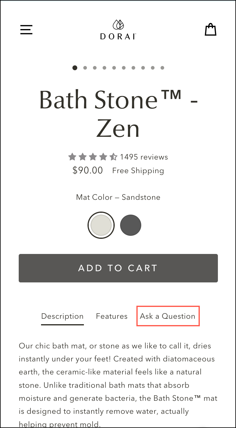
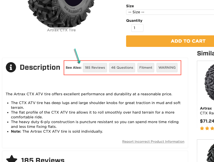
Clever Conversion Trick— Ask a Question Widget
Shoppers are going to ask a question. Retailers who make it easy for shoppers to ask they questions will get to the finish line faster.
We explore this question on our blog
Shoppers are going to ask a question. Retailers who make it easy for shoppers to ask they questions will get to the finish line faster.
Mobile product page layout matters for two reasons. 1: paid mobile traffic directly lands here. and 2: because mobile space is limited.
You have a great story. Content design will ensure people who start reading your story read it from star to finish … and buy.

Sites are slick today. Maybe too slick …
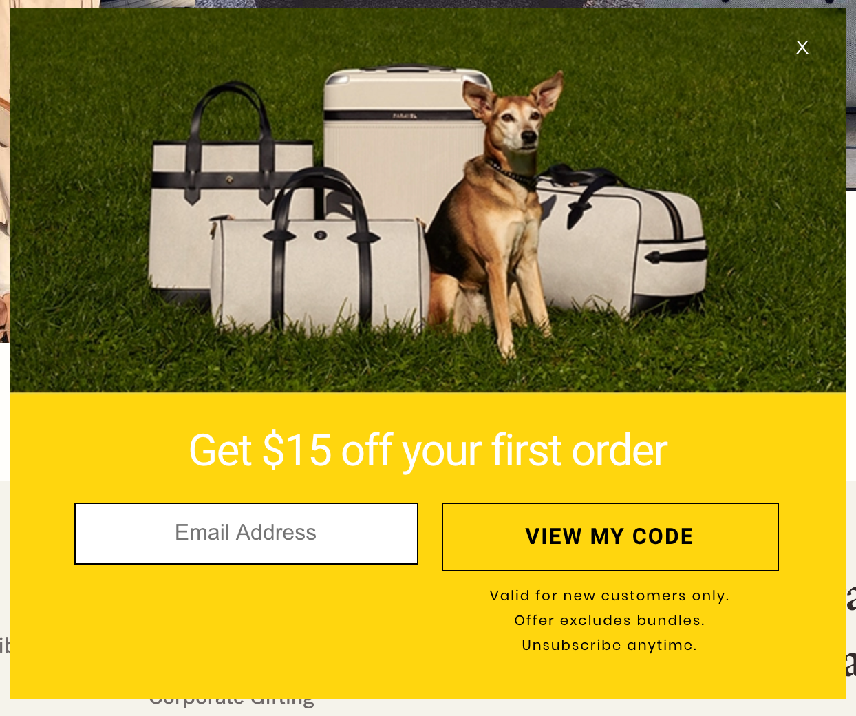
Popup popup everywhere. And yet most suck …
Minimalist design and fine and good but sometimes we just need to show more content while keeping the user’s attention on the page they’re on. Here’s the solution.
Sometimes, it makes sense to go in the opposite direction of the crowd.
Gimmicks work but only for a short while.
As marketers, we need to figure out better ways to ensure shoppers are seeing our popup messages. We’ve provided a number of different ways to do this elsewhere on our blog, but recently, we came across another strategy: three dimensional popups.
Ever wonder why no matter what site you visit a familiar product page layout greets you? We’ve wondered too.
Know what’s more effective than email marketing? Nothing. See this quick post to see how you can double email signup rates.
Simple ecommerce formula: if you make things easy for confused and nervous shoppers they will reward you by buying.
In this post we talk about the most powerful buyer psychology tactic. And we give the best possible example to explain it.
Your site visitors don’t see 83% of what’s on your page. What do we do to ensure the 17% they DO notice is what you care about the most? This article proposes an idea.
There are 2 things we know for sure about online browsers: 1: They’re in a mad rush. 2: 98% of the time they are driven by System 1 (irrational/emotional/quick mode of the brain). More details about System 1. If you want them to notice something we need to slow them down. And you don’t have to have a big bold …
It’s hard to make your Facebook ad stand out. In this ad we show you how.
Hard to explain why but humor has a magical influence over buyer psychology.
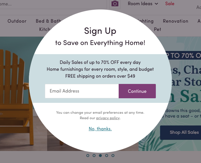
98.05% of pop-ups are ignored. Massively boost your email signups with these SEVEN unique website popup ideas.

What doesn’t get seen doesn’t exist.
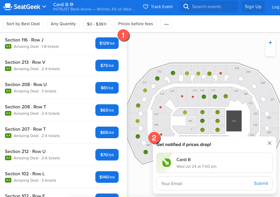
Is there a need for special consideration for a mobile landing page? Yes. If you are driving desktop paid traffic to a self-contained landing page (meaning links from that landing page to the homepage have been hidden) you need to watch this video. In the video, I talk about my experience on ButcherBox mobile landing page:
There are difficult ways to increase conversion rates and then there are simple ideas that work every time.
When people run experiments, they are simply looking at the outcome of the experiment and determining if it was a success or a failure. This can be a problem. We started adding tracking to see how many people were actually clicking on our test elements. Turns out, the number is low. If people aren’t seeing our test element and interacting …
Miracle Method specializes in restoring tubs, ceramic tile, and countertops. When you visit their homepage you’ll see this nifty before/after widget (screenshot): My video to describe how widget works: They could have just shown a video but adding a sliding bar that the user controls is what makes it effective. Remember: conversion rates go up when users feel they are …
We marketers scream when we want the user’s attention. We use comically large fonts and ugly color contrasts; not because they’re beautiful, but because we know the loudest elements capture attention. But there is another way. I was on this product page … … and one of the first elements I noticed was the $ symbol to the left of the …
Having a great product is critically important. But if people don’t click your ad they’ll never find out about it— I have no idea what’s up with the bearded guy behind the coder dude but I sure want to find out.
Don’t just slap on a seasonal promo message. Make it a branded experience, like Revant does (maker of premium lenses)–
When I landed on llbean.com through a PPC ad I was greeted by this popup– CLICK HERE TO ACTIVATE button could have been eliminated. They could have just shown the SAVE10 coupon code. Normally, reducing steps improves conversions. But in this case, llbean.com is adding friction (the need to click a button to activate coupon code) and it’s a brilliant strategy. Why? Because CLICK HERE …
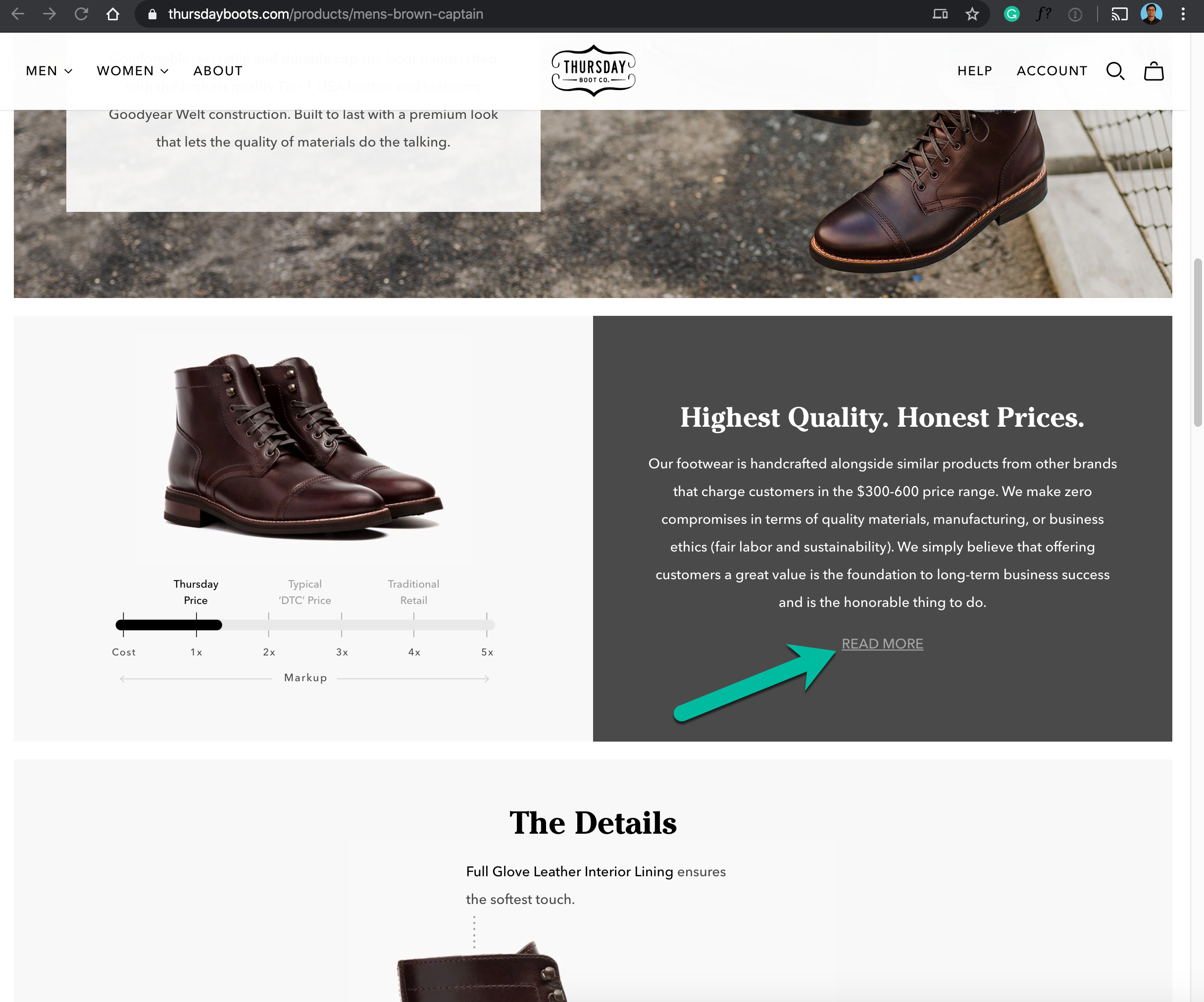
If you’re running a super-efficient business (and ecommerce is way more efficient than traditional retail) then you’re offering shoppers excellent savings. But, if you don’t explain ‘how’ these savings are possible shoppers might associate low prices with poor quality. Saatvamattress.com uses a simple visual technique to communicate the amazing savings they offer– Saatva brings its luxurious mattresses to you for …
Online retailers need to communicate a lot of information on product pages. A wall of text can hurt conversions. You need a product page infographic.
Here is a screenshot of the top half of mytarp.com— Spend 30 seconds looking at it and tell me which page element grabbed your attention the strongest. [Don’t scroll down till you’ve made your selection] For me it was the ugly neon green “Custom Made Tarps” message. Assuming mytarp.com makes highest margin on their custom products (which they most likely …
These days many sites have promos where they offer shoppers a discount if they ‘comment on’ or ‘like’ their brand on Facebook. Most display these promos on landing pages or product pages. While those locations are OK the best idea is to do what saatvamattress.com does, they show their message on the cart page, where it has the highest chance of …
Stop everything, open Google Analytics, select 9 month time period and see Conversions—> Ecommerce—>Product Performance report. It’s highly likely that your top seller sells 2X as many units as the next best seller (Zipf’s law). Now go to your top seller product page (on your site) and copy page link name. Return to Google Analytics and go to Behavior—>Site Content—>All Pages report and …
An incredibly large number of shoppers abandon during checkout. On the first half of their visit (homepage, category page, product page and add to cart click) shoppers are building a mental case for buying an item. During second half of visit (cart page, shipping and billing page) they’re building a case to not buy. During this phase even the slightest inconvenience …
In a previous post I debated if Quick View interface was really needed. Basically, Quick View is a mechanism online retailers use to allow shoppers to buy directly from subcategory pages (bypassing the product page). Example— When Quick View is clicked a lightbox like this appears— Why I hate Quick View— product images on category pages are shrunk down, and Quick …
On swansonvitamins.com not only do they show Risk-Free Purchase Guarantee on product pages they show Lee Swanson’s picture next to the guarantee message for added effect. And I can tell you, these tactics work—
LDproducts.com is a site that used to only sell printer supplies. I first visited ldproducts.com a few years ago, since then they’ve expanded to a whole line of office supplies. When I went to their site recently I saw this homepage overlay message— This overlay is a home run because— A. It’s only targeted to visitors who last visited when ldproducts.com …
Cadence is a watch brand. Here is a screenshot of the top section of their About Us page— I love 2 things about it— 1: As you scroll down the page the brand story is revealed, and it’s written really well and presented in a highly readable way.2: As you scroll down to read About Us content, from the left …
Zappos.com is proud of its free shipping free returns policy. So they want to ensure every visitor sees it. When you first land on their homepage (does not repeat during session) they play a short but prominent animation to highlight free shipping free returns (top right corner of the video below)—
Quill.com sells a huge selection office supplies— from dozen varieties of ink cartridges to paper products. Shoppers who are browsing multiple product pages might have a hard time keeping track. This is why quill.com has a prominent floating element (anchored to the bottom of page) that displays recently viewed items. Closed state— Open state— What I like about this tactic— 1: Makes …
Someone needs to let the graphic designer behind delphiglass.com know that we’ve seen amazon.com. Delphiglass.com homepage— Amazon.com homepage (notice sections pointed by red arrows in screenshot below)— What surprises me about Delphi Glass is that it’s an established company (started in 1972), with nearly 100,000 monthly site visitors, and products (artistic glass project supplies) that are available all over the US. The worst part …
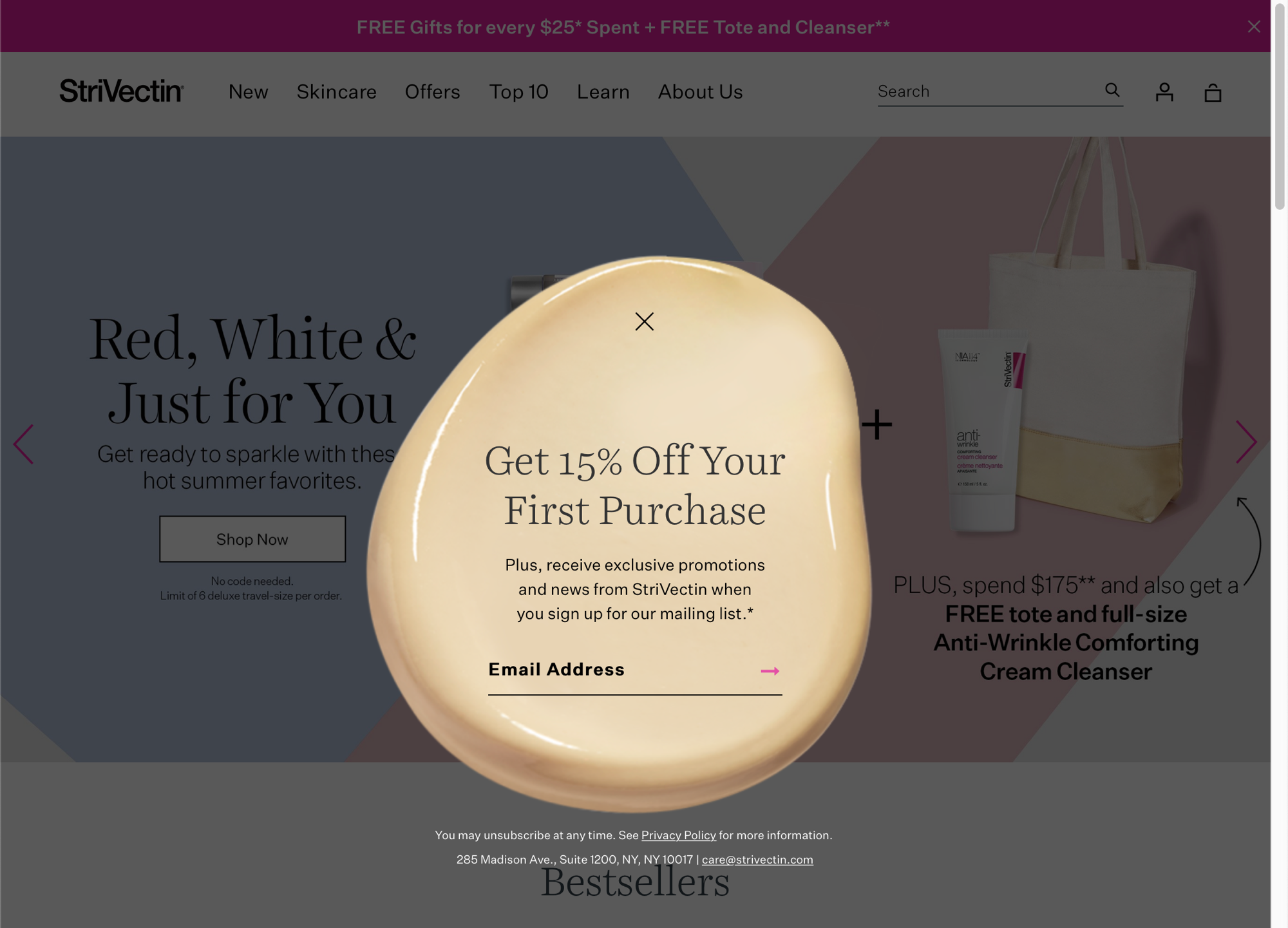
Nearly all email signup forms look the same and make the same promise (we will not spam you). If you’re looking to dramatically improve email signups why not try something different? An example shared by my friend Vanya Buvac. The screenshot below was taken from sixthdivision.com—
Love two things about this payment details section on netflix.com– 1: Ginormous text box font size. Awesome.2: Showing lock icon in Credit Card and Security Code fields. Love it.
Crutchfield.com prides itself on its technology advisors. They use this in their marketing. On their website they even show a real-time counter of how many advisors are currently available to help with your technology questions– Moral of the story– If you have an awesome asset, like knowledgeable customer service staff, make sure your site design draws attention to it.
If your category pages allow visitors to directly add an item to cart (pointed by blue arrows below) … … you should run a test in which Add to Cart is replaced by Learn More. I recently ran that test and noticed a 73.9% lift in product page visits. My theory on why Learn More outperformed Add to Cart— When visitors see …
If you have a call to action (definition– call to action is an interface that encourages visitors to take the next step, like add to cart button or signup for newsletter box) that has a high conversion rate (meaning visitors that interact with it convert at a rate much higher than site average) do more to make it super visible. …
Most checkout pages ask for details in this order– 1: Shipping/billing info2: Credit card info3: Purchaser’s email address address How can we be sure this is the most efficient way to organize checkout flow? Beachbody.com does things differently. They ask for details in this order: 1: Purchaser’s email address– this way, even if the purchaser doesn’t complete the order (abandons midway) chances …
Amazon.com is known to test every site feature. Therefore, whenever I see something on Amazon.com I just assume it’s there for a reason. Today, I noticed something I couldn’t explain and would love to get your feedback. Here is a screenshot of an Amazon product page. You will notice some hyperlinks aren’t underlined and others are– Best practice is to …
This e-tailer has discovered a genius tactic to engage visitors and get them to click Google+ button—
On a credit card digits are shown in this format– XXXX XXXX XXXX XXXX However, when I make a purchase online the credit card field is a simple text box. Because all 16 digits appear as one block it’s hard to double-check digits by looking at the credit card. I’ve never seen a site that displays digits exactly as they …
If you want to communicate an important message do what skullcandy.com does– I would have made 1 change– added a close button to free shipping banner so that visitors have an option to remove it from their screen.
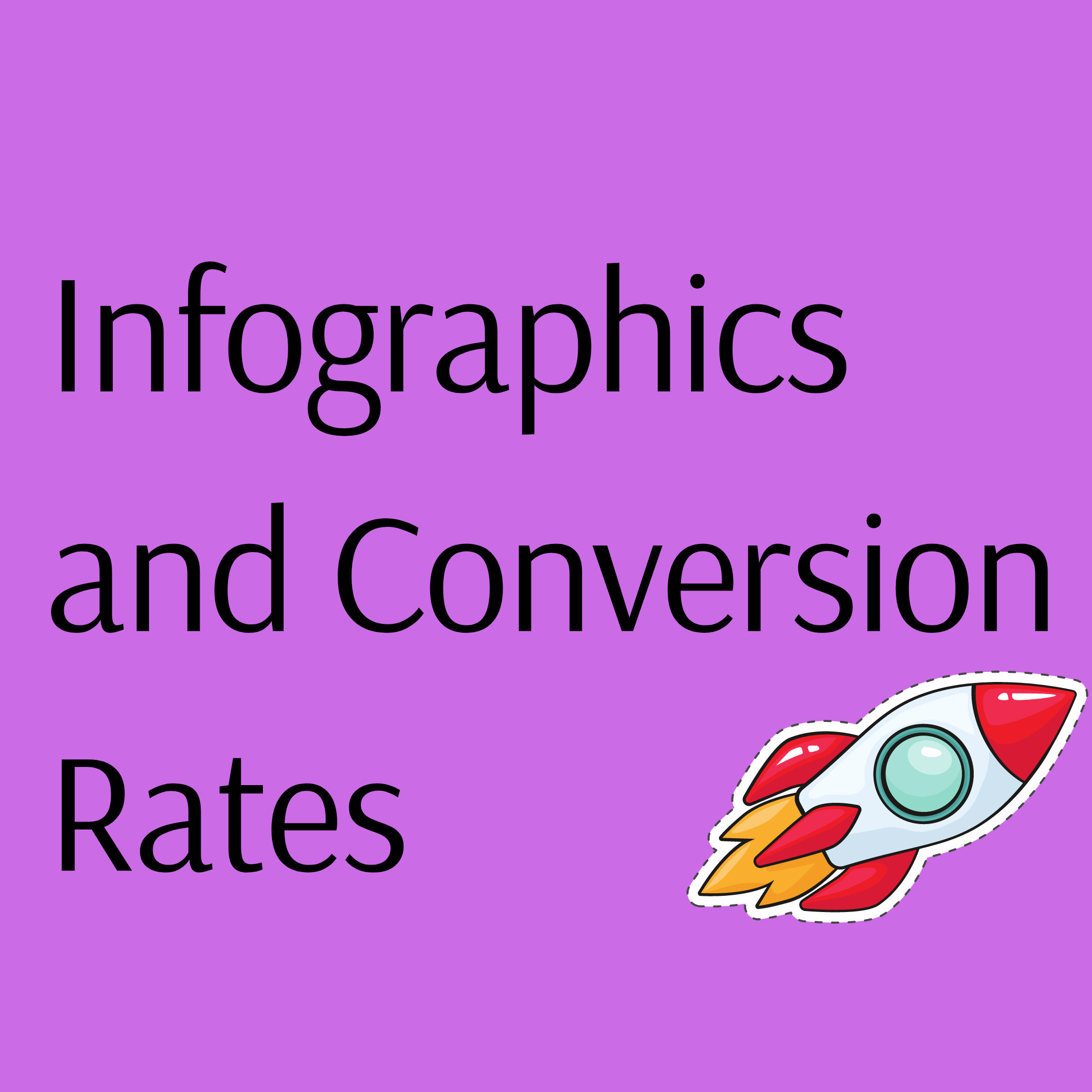
Infographics are used to convey information visually. With infographics, you’ll be able to majorly improve conversion rates.
— They still don’t let customers review products.— Generic filter options – price, title and new. What about – most popular, biggest discount, most gifted, VHS, etc? They do have a Best Seller list but that sorts all titles, one can’t search best sellers within a category. They have adopted the lowest common denominator with their eCommerce strategy. Here is …

I like seeing marketing ideas I've never seen before
True or False? ??

Then you are in the right place.
Receive 1 unique conversions idea in your inbox every week. Interested?

We use a specific copywriting formula to convert new shoppers to a site.
Each week we'll email you an example to your inbox. Interested?
See you Monday!
Check your inbox to confirm your subscription. Next stop, higher conversions.