
Blog
Impact of Content Design on Conversion Rates
I’ve only recently realized the power of content design.
Having a killer sales pitch is super important, but if your content design is bad and readers don’t read it from start to finish they will never buy.
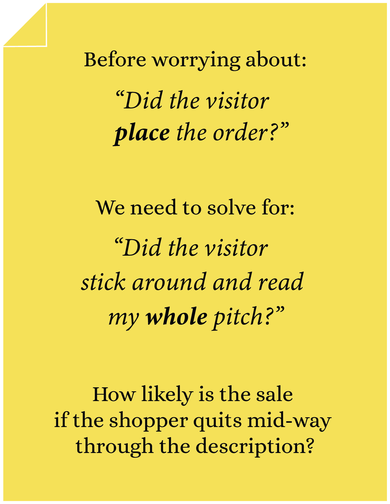
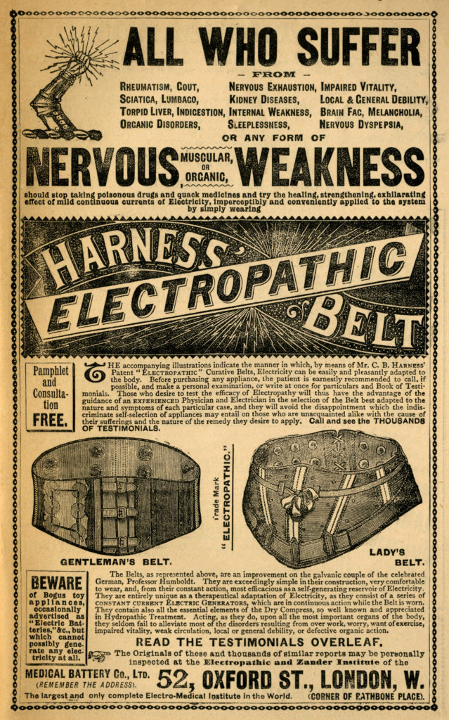
Marketers have understood the importance of content design for a long time.
They’ve been working on it for the last 150 years.
Here are the content design variables the copywriter can play with–
1: Font Style
If you Google “font size and conversion rates” you’ll find articles that recommend things like serif font.
This isn’t an area I’m an expert in. But as someone who studies 20 product pages every week, I know there are some fonts that are just more pleasant to read. We want to create a smooth frictionless reading experience. Not sure about you but I find this simple typewriter font super easy to read:

2: Font Color
To facilitate readability you want to ensure there is a good contrast between the font color and background canvas. Light gray on white is ridiculously hard to read:
3: Font Size
Large font size = more readable = higher conversion rates.
If you’re a DTC eCom site with a goal of maximizing conversion rates please increase your font size.
“What Font Size Should I Use to Maximize Conversion Rates?”
D. Bnonn Tennant has written an excellent article on the subject. It’s linked lower on the page, but here are the key takeaways:
- Use 16-pixel font size.
- 16-pixel font size is about what you’d find in a book if you factored for reading distance. We keep books quite close to our eyes. If you adjusted the distance to match the distance from our screens you’ll end up with about 16 pixels.
- The harder your text is to read, the less of it will get read . If you are an e-commerce business, this is a big problem.
- At age 40, only half the light gets through to the retina as it did at age 20. For 60-year-olds, it’s just 20%.
- Some people might protest by saying, “but users can zoom”. The article has a great response:
Not so. The users who will most need to adjust their settings usually don’t know how to. And the users who do… well, they’ll probably just take the easier path by hitting the Back button.
You can read the whole article here.
Giving Users a Say About Font Size
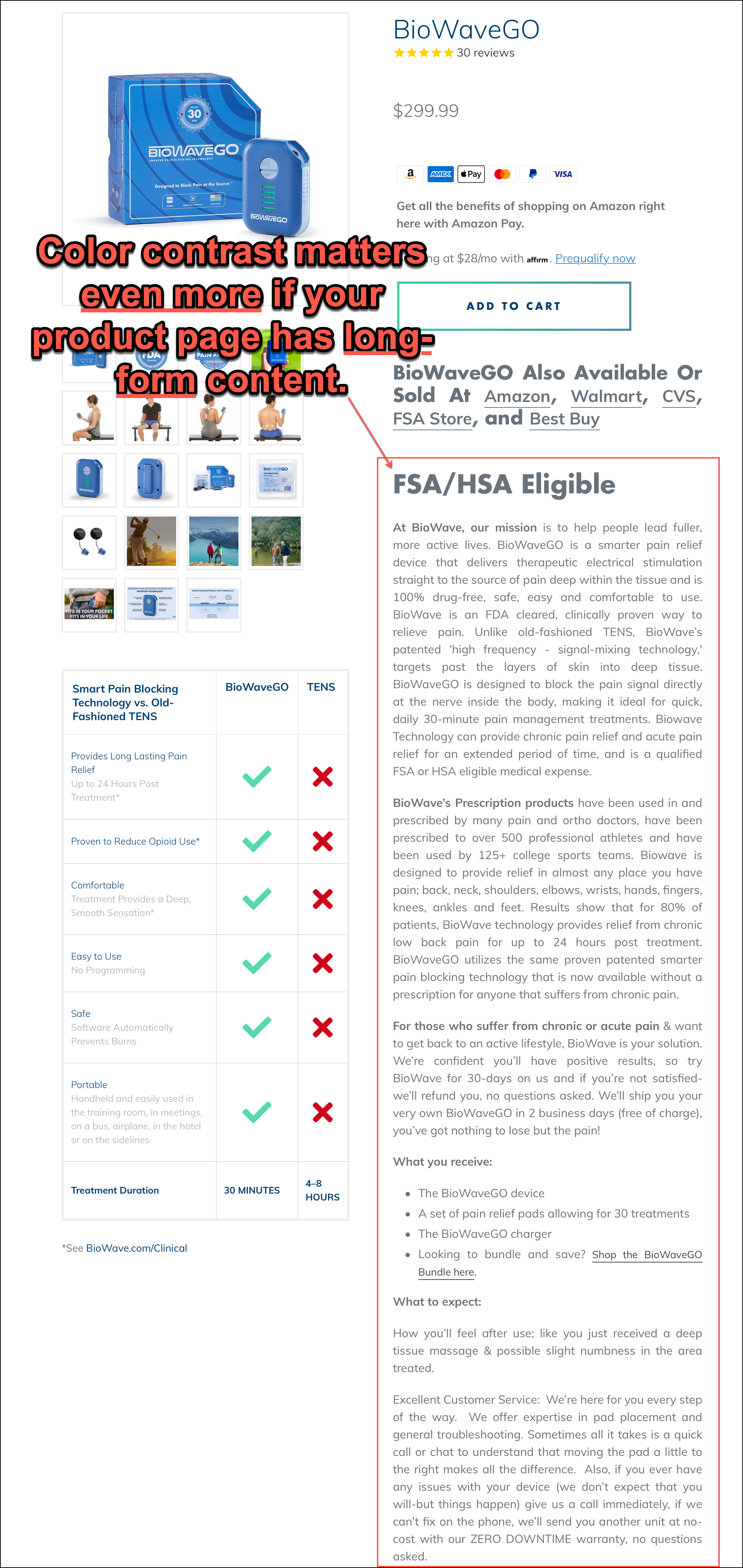
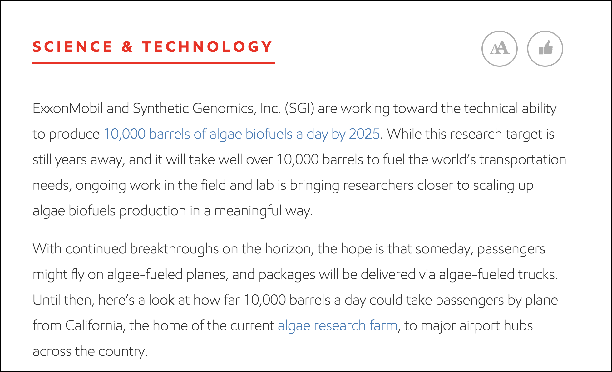
It’s possible you are convinced about using the bigger font but want to give the user a say in the matter. There is an elegant solution for this on the ExxonMobil.com site. By default, they show the font in normal size but give the user the ability to increase it:
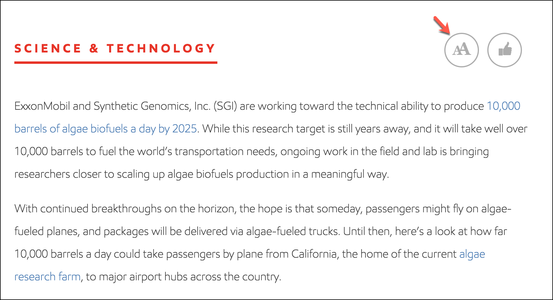
On click:
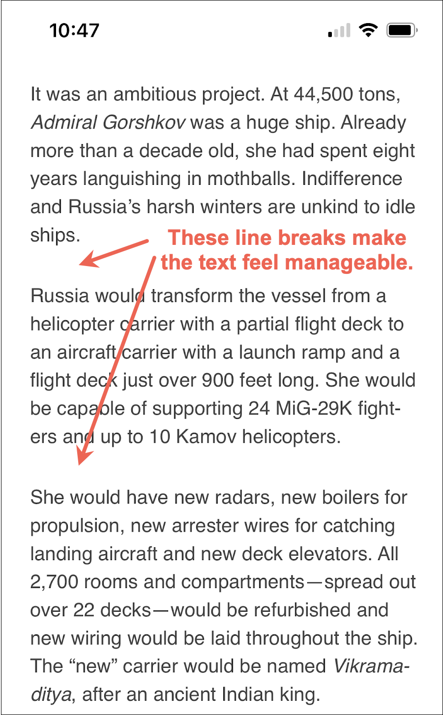
4: Spacing and Formatting
Things you should do to make your content feel less intimidating:
- Bolding, when necessary (shown in example 1 below)
- Nice spacing between sections:

- Break into columns, when necessary (shown in example 1 below)
- Checkmarks, when necessary (shown in example 1 below)
- Highlights, as needed
Example 1
The screenshot is taken from bullymax.com:

Example 2
Taken from SportRx.com:

Notice the product description. There isn’t really any structure right now—no way for the shopper to quickly find the answers to their questions. We’re willing to bet many shoppers are not reading this description.
The solution is simple, and we don’t even need to remove any of the copy. Take a look at our idea:
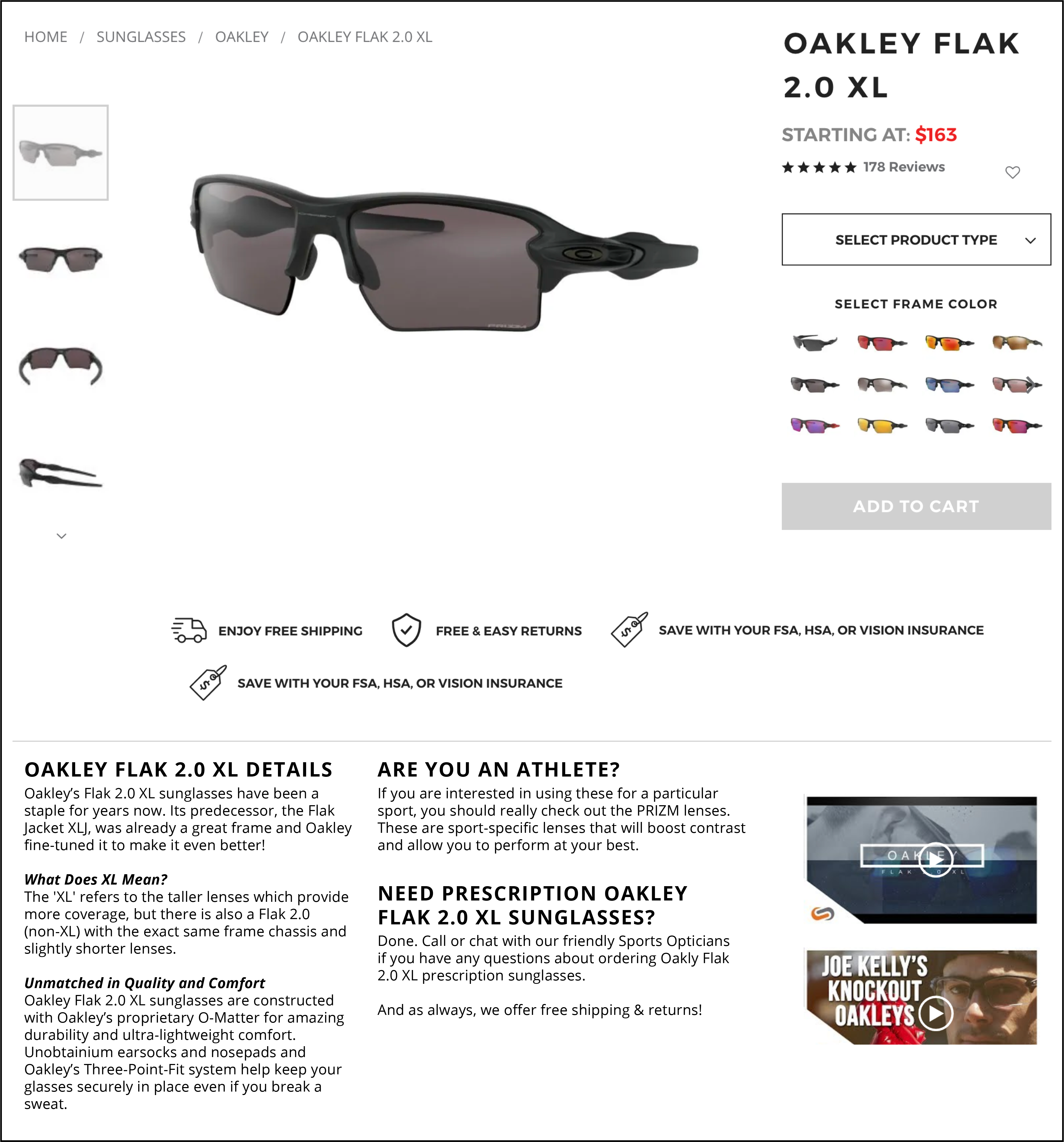
As you can see, all we’ve done is split the copy into sections. Each section has a heading or subheading, which vastly improves readability and immediately lets shoppers know where relevant content can be found.
Example 3
Some of you are more design-obsessed and want to use more design to optimize conversion rates. I get it. Here is a way more visual example that still doesn’t take the focus away from the product story. Screenshot from SmartWool.com:

Did Content Design Tweaks Help?
You’ve done the hard work of reformulating your page design to encourage shoppers to read from the top to the bottom of the page. But how do we know if shoppers are actually reading to the bottom of the page? There are two options here.
Simple Option– Scroll Map
Using a free tool like Hotjar.com (see their free plan) you can add a line of code to your site (it’s ridiculously simple) and Hotjar.com will create a scroll map of the page that’ll show how far down the average page visitor traveled. It’ll look something like this:
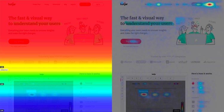
The scroll maps visualize the most popular (hot) and unpopular (cold) elements of a page using colors on a scale from red to blue.
Take a screenshot of the page before making tweaks. Then take a screenshot after tweaks are live. If the hot color region is expanding you’re on the right path.
Harder Option– Scroll Tracking with a Developer’s Help
Google Tag Manager (GTM) is a tracking tool from Google. Using this you can set a trigger on a page to know how far down visitors got.
For example, using GTM you can set these three percentages for a page– 10, 50, and 90.
Now when a user scrolls 90% of the way toward the bottom of the page, the tag will fire three times: Once at 10%, once at 50%, and once at 90%.
To learn more see this article: Scroll Depth trigger.
Content Design– Next Steps
If you arrived at this article CHAPTER 4: Product Page Optimization our next discussion item is Feedback Beacons. If, however, this is the first time we’re meeting we have a very special gift for you. Ready? Marketing Secrets.


Comments 3
That really does make a difference. If I was shopping for glasses I would want to read that, but I might skip it if it was just a big blob of text. Because (like you said) it feels like a chore. But when you have the big bolded text, I know what the topics are about and I can read what interests me. Very nice Rishi!
ReplyRishi Rawat
Glad you liked the idea, Tommy 🙂
ReplyThis was a very informative blog and I really enjoyed reading it. But I also have a few points regarding it to discuss with you.
Design thinking starts with the ideation phase and proceeds to prototype development, user testing, feedback gathering, design iteration, and final revision.
The following are some of the steps typically involved in a design thinking process:-
1. How to Implement Design Thinking to CRO?
2. Why should you focus more on design to achieve success?
3. Empathize with your users
To check the full list of tips, visit – https://blog.alakmalak.com/why-is-design-thinking-important-for-conversion-rate-optimization/?UTM-andrew-aug/
Reply