
Blog
Popup Design that Can Boost Conversion Rates in 2019
Practically every site in the world has a popup. Most have a similar popup design. Typically, they have a popup that appears the moment the shopper lands on their site. Because of the ubiquity of these popups, shoppers have become conditioned and desensitized to them. Ultimately, the vast majority of shoppers immediately close out of these popups without reading a single word.
As marketers, we need to figure out better ways to ensure shoppers are seeing our popup messages. We’ve provided a number of different ways to do this elsewhere on our blog, but recently, we came across another strategy: three dimensional popups.
Take a look at what StriVectin (strivectin.com) did on their homepage:
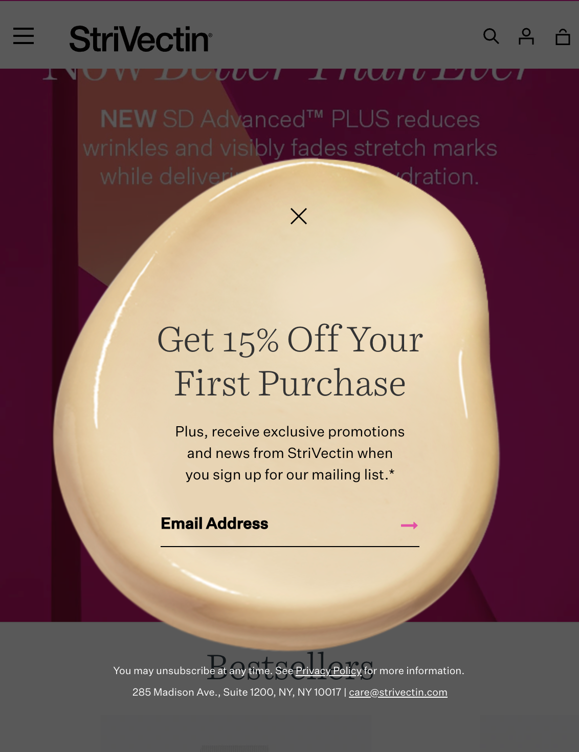
As humans, we are especially good at recognizing patterns. This means that when something unexpected is thrown into the mix—like a three-dimensional popup instead of the standard popup—our brains are immediately drawn to it.
We believe a popup like this will make many more shoppers pause before immediately clicking on the close button. Those extra seconds could be all it takes to get more shoppers to read your messaging and convert. It certainly got us to pause and write this blog post.
What do you think of StriVectin’s popup design? Want to see another idea? Click here.


Comments 1
Love the shape of this podcast. As someone who hates pop-ups, I would actually appreciate this.
Reply