
Blog
Our Process: Stasherbag.com
We are always looking for ways to show you our process, so here is an example of what we would have done if we were working for a site like Stasherbag.com.
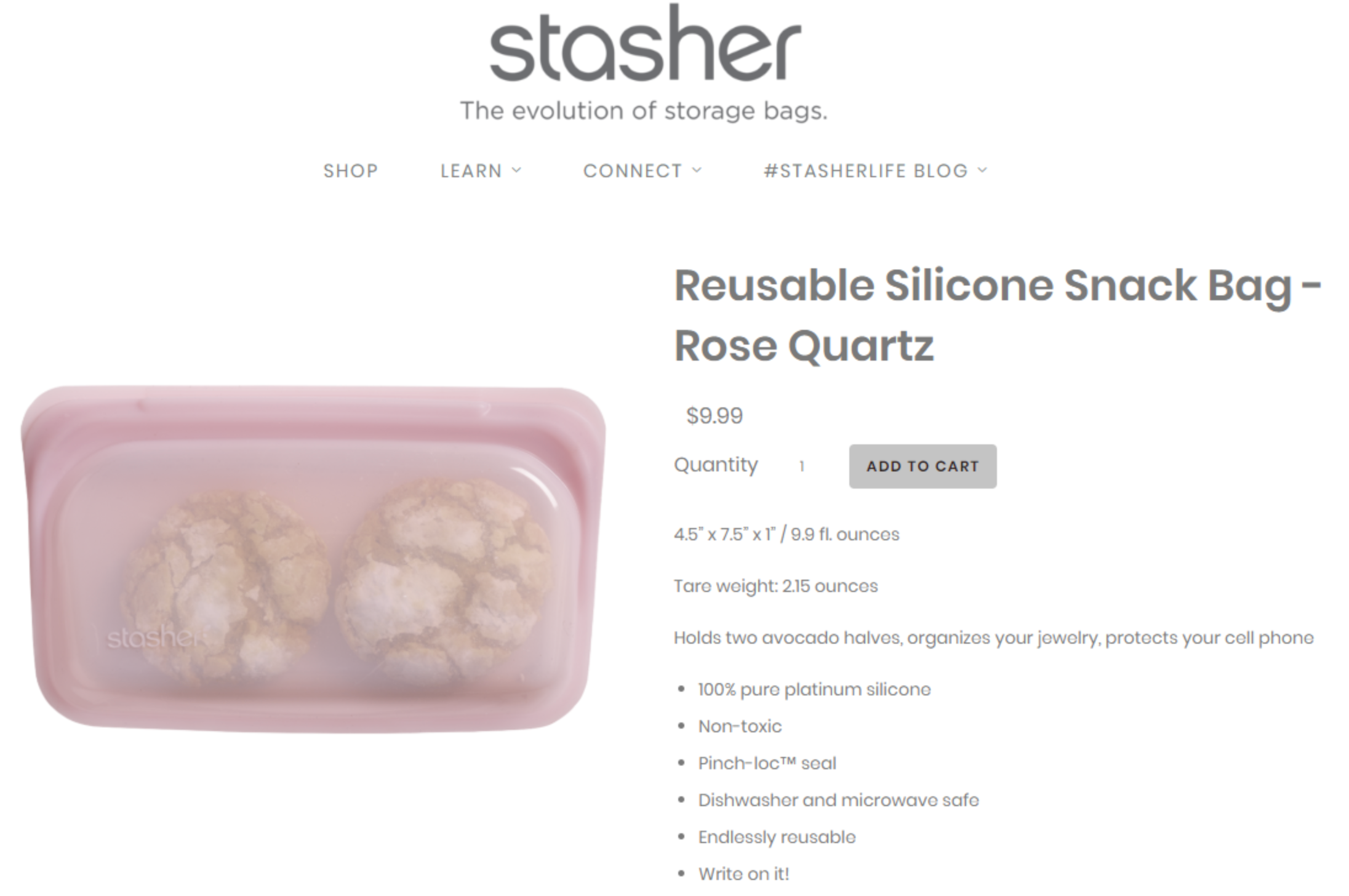
Stasher is a product that reduces the use of plastics (you know, the ocean killer). Yet, on their product page, they simply don’t talk about this (and if they do it’s so buried we weren’t able to find it).
What Stasher’s product page currently looks like:
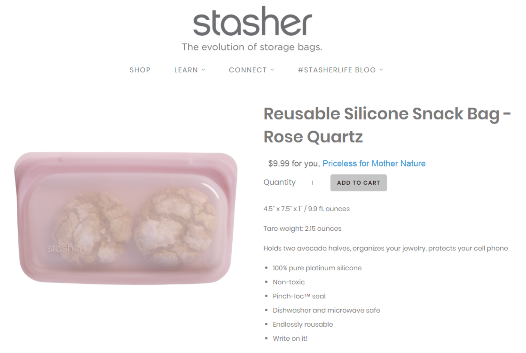
This is our concept (notice how we’ve placed our test element, “Priceless for Mother Nature”, near the price, where this pitch makes the most impact):
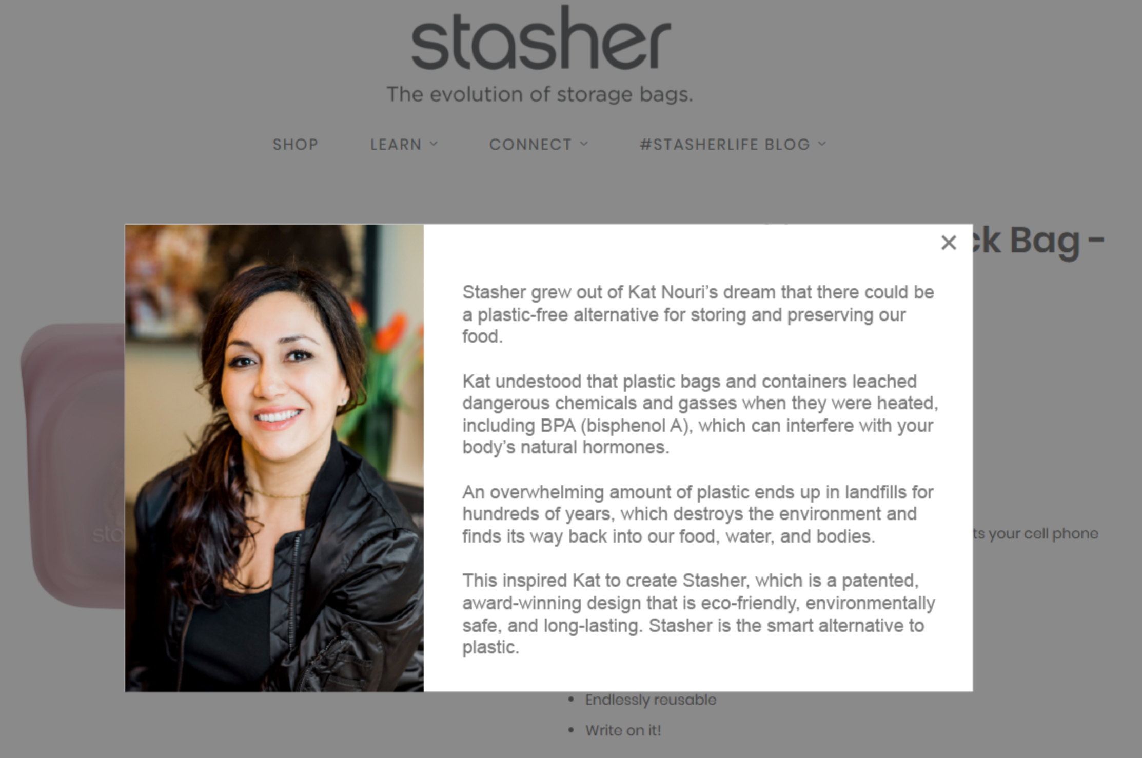
This is what appears after shoppers click on “Priceless for Mother Nature”:


Comments 2
thanks, Rishi – I agree, that is a definite improvement.
ReplyRishi Rawat
Thanks for inaugurating the commenting interface on my new blog.
Reply