
Blog
Active Participation: The Ultimate Conversion Cheat Code
eCommerce has been growing rapidly for 20 years. But there is one area where innovation has been lacking.
It’s still very much a broadcast medium, with the marketer doing all the talking.
The visitor (our hero) can’t talk back. They can’t participate in the buying process.
And that’s why Active Participation was invented.
The idea behind Active Participation is to allow the buyer to shape the buying process.
If two people visit the same site but interact differently, Active Participation allows them to have personalized experiences.
6 Uses of Active Participation
1: Surfaces Content That Most Interests Our Visitor
Different buyers care about different details. We had this dilemma with a running shoe brand called Giesswein. They sell running shoes with woolen uppers:
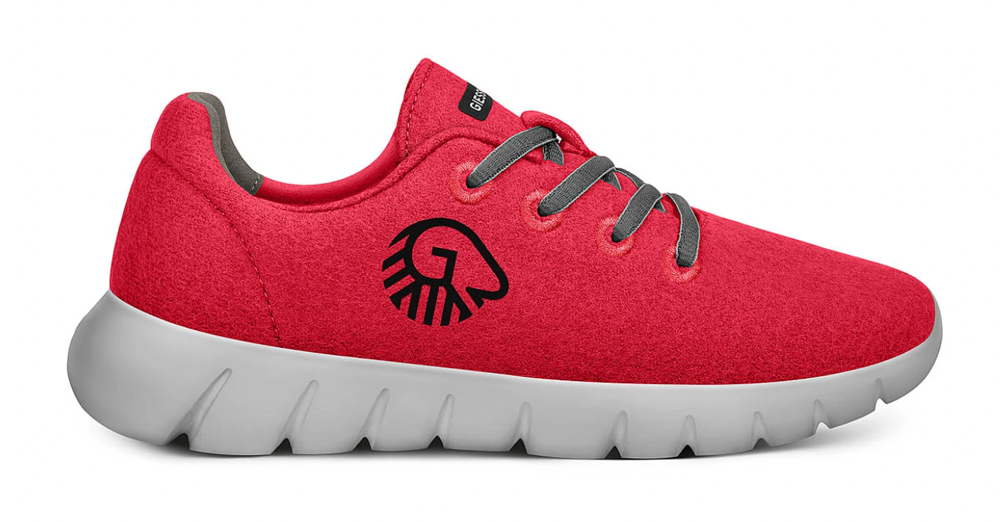
There were so many important details to discuss for this revolutionary shoe. Details like the fact that the material is 100% natural, our return policy, comfort, etc.
Cramming all this content on the page could would make the page super long. It would end up being a little something for everyone, and that is the worst way to optimize conversions.
So, we showed this element:
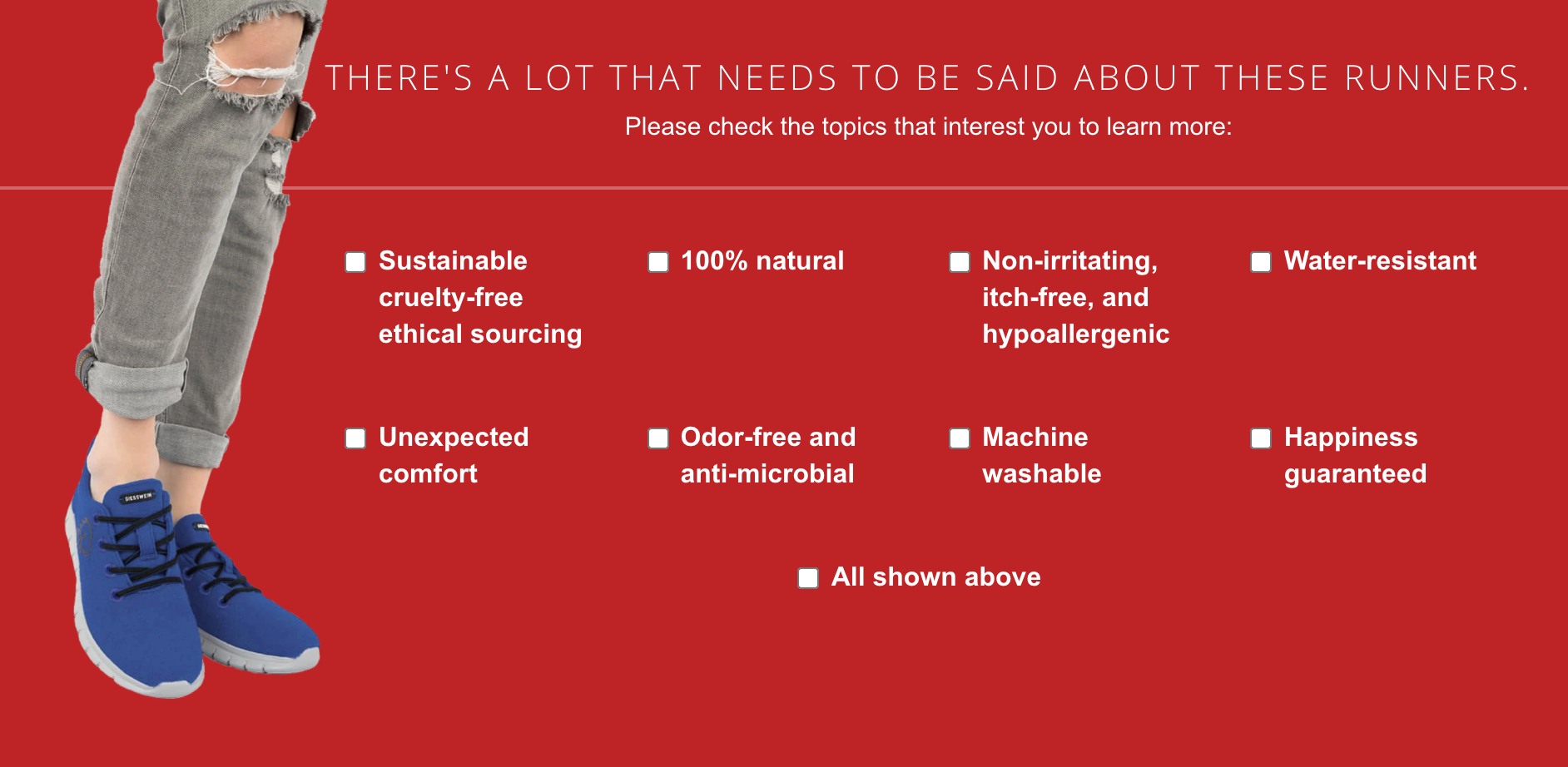
Now the user is given the option to check the topics they care about the most. Based on their selections they are shown content that singularly talks about their topics of interest. And if someone is interested in all the details (methodical shoppers) they could click the All shown above checkbox in the screenshot above.
It’s important to note we didn’t present this menu at the top of the page. We first warmed the page visitors with the opening of our product story and then presented this menu element.
The result: 29.28% improvement in bestseller sales. Case study.
2: Formats Content to Match Visitor Personality
Your product page is visited by two types of characters: Skimmers and Diggers.
Skimmers like short and to-the-point content. Diggers like to dig into details.
The mistake marketers sometimes make is that they try and speak to these 2 shoppers at the same time. That’s hard as hell. Active Participation to the rescue.
We were working on a test for a room air purifier (EJ120). This is a highly technical product. There were details like MERV17 rating, quiet German motor tech, and 0.3-micron filtering that needed to be explained.
These were details that would really appeal to the Digger. The Skimmer, on the other hand, would just need the quick version of the sales pitch.
So here’s what we did. We added the question How much time do you have? to the page:
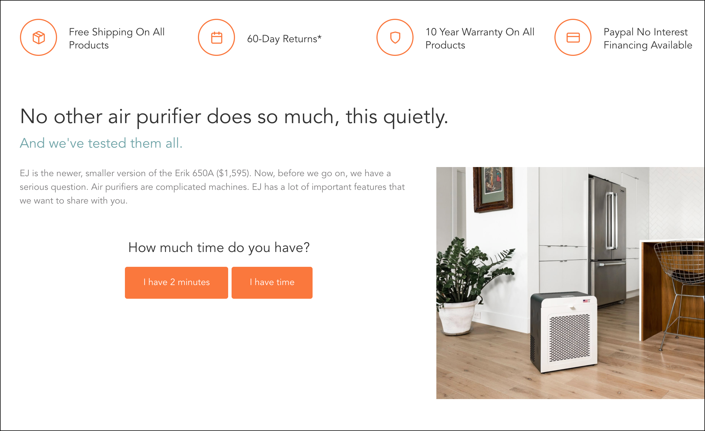
Now, instead of guessing what type of reader was seeing the page, we let them identify themselves.
We knew Skimmers would be drawn to the {I have 2 minutes} button. On click, they were shown the quick elevator pitch. The word count might have been cut but we made sure every word counted.
Diggers, on the other hand, would favor the {I have time} button. And when that was clicked we showed everything in incredible detail. 3 pages full of educational content.
The result: 30.56% increase in bestseller sales. Case study.
3: Personalizes Based on Visitor’s Awareness Level
Imagine you sell a juicer.
Your product page visitors will be in these 3 awareness levels:

Someone new to juicing

Someone familiar with juicing but new to your product

Someone deep in their juicing research journey
Your sales pitch will be so much more powerful if it were personalized to the awareness level of these 3 visitors.
The other benefit of crafting copy based on levels of awareness is that it drastically reduces word count because now you are writing for just one audience.
One Note
You don’t want to show the visitor a prompt asking them for their level of awareness the moment they land. That approach is jarring and somewhat ineffective.
A subtler approach works better. Let the visitor settle down first. Show them the opening of your story, hook them with your opening, and then ask them to self-select themselves.
Going back to the juicer example. Here’s how I’d do it.
Mockup (be sure to read the opening copy):
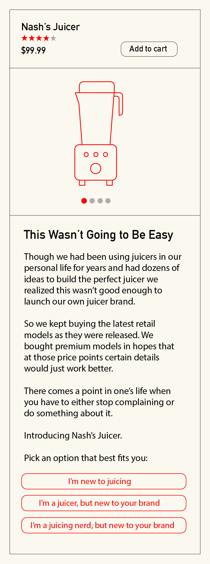
Based on which of the 3 buttons above is clicked the details lower on the page would be hyper-personalized.
4: Tracks Content Comprehension
How do we know if our marketing is working?
If you sell a technical product with technical details it’s important those details are clear to our reader. So we added {Clear} and {Unclear} buttons (you’ll need to look closely to see them in the screenshot below):

These little content clarity feedback widgets are called Feedback Beacons.
Functionality
If the reader clicks {Clear} show a Thank you message for 2 seconds, then hide the whole dialog.
If they click {Unclear} reveal a dialog box. This dialog box could now ask specific questions related to the paragraph.
The small button size is intentional.
We don’t want it to be visible to visitors at top of the page. We want the buttons to be noticeable once the visitor has read the relevant block of text.
So this is what we’d insert within the story. The other thing we’d do is this:
At the bottom of the product description or informational popup add this:
Did we answer all your questions? {Yes} / {No}
Only the most motivated buyers (your best prospects) will reach the bottom of a page/popup message.
We know that if shoppers have unanswered questions they will not buy. This is an opportunity to save a hot prospect. For people that click No ask for their email address to put them in contact with customer service. Pronto.
In this case study you’ll notice we’ve included a lot of Feedback Beacons along the long-form sales pitch: Conversion Copywriting: Close the Sale in Under Three Minutes.
5: Identifies Research Mode Visitors
Two types of visitors reach your product page: people in research mode and people ready to buy today. The way we present our pitch depends on the mode the shopper falls into. You can use Active Participation to get this info from the buyer. This approach is explained in detail in this post: Product Page Intent: Research Versus Buy.
6: Ensures Important Details Are Noticed
Some parts of your story are minor details. Other parts are crucially important. If an element is important not only do we want our visitor to notice it, we want her to notice it in the most dramatic way possible. You can use an Active Participation element for this.
Notice the partially torn Reveal button:
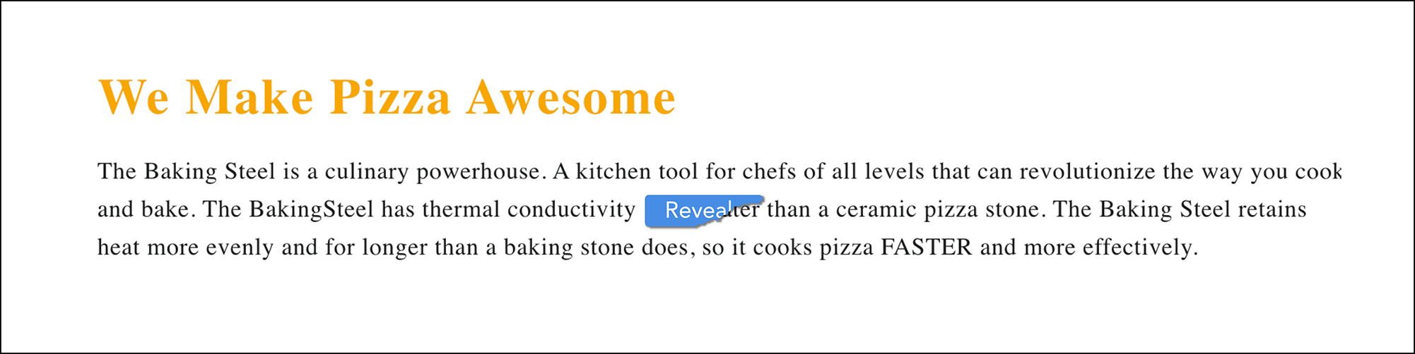
And this is what the user sees when the reveal button is clicked:
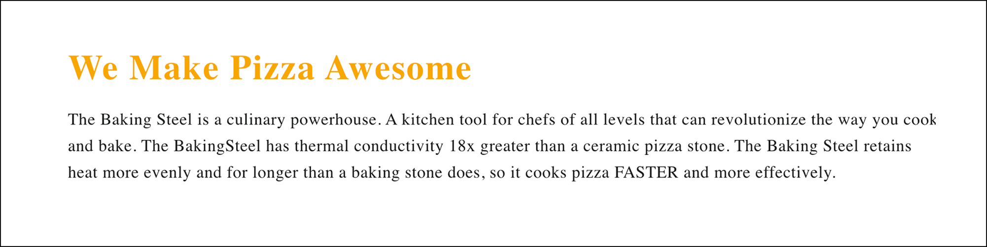
Our idea was to use the Active Participation element to both draw attention to and dramatize the 18x stat.
Want to Dig Deeper Into Active Participation?
For 98% of marketers, the content above is enough. If you are in the 2% you’ll like this interview.
Backstory
Lorenzo was probably the first person to understand its implication. So it was real honor (and a lot of fun) to have him interview me about it:
Next Steps
Personalized experiences are just 1 of the 9 elements in our sales pitch construction kit. The next item on that list is People Like Knowing They’ve Stumbled Onto Something Rare.


Comments 3
This is absolutely awesome, love the idea of micro interaction as the customer reads the product description, will go ahead and try this on several pdp:s. Thanks Rishi.
ReplyQuality article, Rishi!
Love the “how much time do you have?” and “did we answer your question yes/no?” experiences. I can’t think of another data point which would be able to give you this much insight into what type of info package is most helpful to your customers at what point (maybe offering them more info further down the funnel compared to in their researching stage) and what questions they have that you as the seller are currently not answering.
As an example, Shopify actually do a really good job of this at the bottom of a lot of their technical help articles.
Is there a reasonably entry-level tool that you’d recommend to track interaction and conversion uplifts on these tests?
Cheers,
ReplyRishi Rawat
Google Optimize is a great place to tip your toes into A/B testing.
Reply