
Blog
Converting Shoppers Who Aren’t Ready to Buy Today
Your product page receives two types of visitors– people who are ready to buy today and people in research mode who need time to think about it.
A 2017 Baymard Institute study found that 57% of visitors who abandon shopping carts do so because they are in research mode.
Don’t make the mistake of trying to force a sale. You will fail (personal experience).
Instead, do this: for visitors in research mode shift the focus to earning permission to keep in touch.
The case study below reveals how we use this tactic.
Case Study
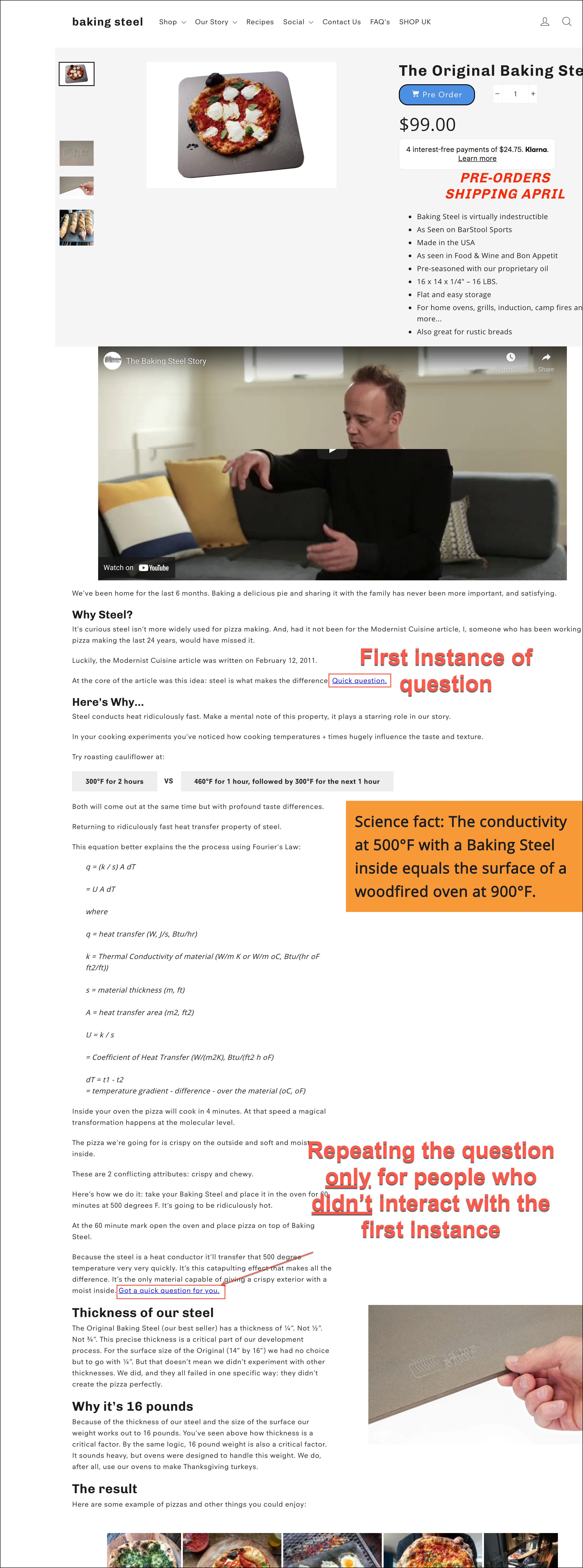
We were working on optimizing the bestseller sales for BakingSteel.com.
One critical question was knowing if the visitor was here to buy or simply to research. Our strategy would have to change based on the bucket the visitor fell into.
So, at two (2) strategic locations, we inserted a question. Notice how the questions are subtly woven into the product description. They don’t stand out and will only really be visible when readers’ eyes reach that section of the page. Notice the two red boxes + commentary in the screenshot below:
And this is what we showed when the user interacted with our question:
What best describes your visit today? {Research} {Buy}
For people who clicked {Buy}, we simply displayed a Thanks for your feedback message for 2 seconds and got out of the way.
But for people who clicked {Research} we showed this offer:
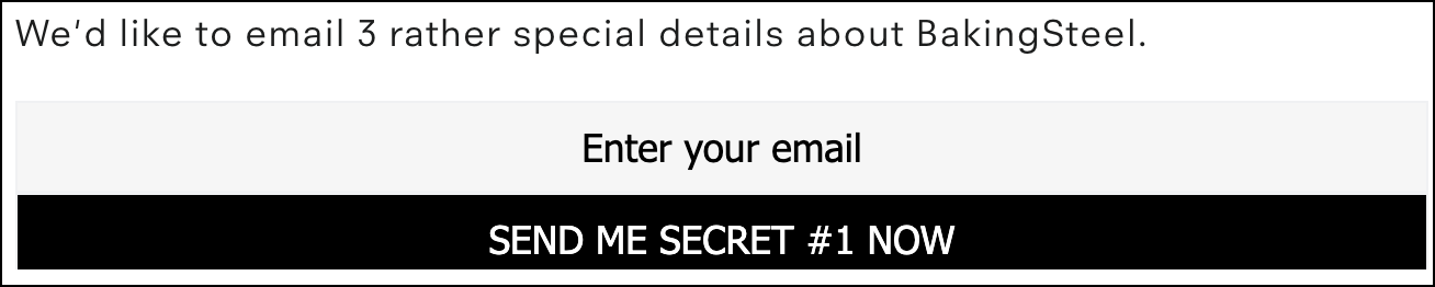
The idea was simple: convince and convert shoppers in research mode via email.
Does this make sense? /

But we didn’t add them to the client’s general mailing list; they were added to a mailing list exclusively built for people in research mode.
Once signed up we sent a series of three (3) highly targeted educational emails about this specific model.
The emails didn’t talk about any other product on the site, didn’t add fake urgency, and didn’t offer any discount. They just subtly talked about the many ways in which this model was magical.
Basically, we took the product page sales pitch and expanded it into a 3 part email series.
We were careful not to rehash the product page pitch word for word. The copy was rewritten so the reader would find it new and interesting. And because the product page was broken into 3 emails it could go into more detail on each point of our sales pitch.
This approach allowed us to both maximize conversions of buy mode visitors (we were able to boost product page conversions by 46.42%) AND add many thousands in sales for people in research mode.
The test was so successful the product went out of stock.
One Important Detail
In the screenshot above you would have noticed we repeated the question at 2 locations. That was done because shoppers are highly distracted and only notice around 20% of what’s on a page.
In our concept, we added smart logic so people who click one link will not be shown the next link.
This maximizes visibility while minimizing repetition.
Revealing It All
We’ve spent the last 14 years in our marketing lab, experimenting on online shoppers. We’ve learned a crap ton and are ready to share those learning.
We want more marketers and CEOs to know about it.
Eventually, we’ll make this into a book. If you want to get an unfair advantage over your competitors now is the time to steal our ideas because once they are published the cat will be out of the bag 👜 for all to see.
Each chapter in our forthcoming book will feed into the next. Click the link that best describes where you want to start the story:
Chapter 1: is all about conversation rate optimization (CRO). It talks about the history of CRO, statistics of CRO, and describes how most agencies do CRO. We need to describe how most are doing it before we reveal our process, which happens in Chapter 4.
Chapter 2: For every 1,000 product pitches encountered the shopper buys one item (and we’re being generous). If you want the consumer to choose your product your need to understand their selection criteria– you need to understand their buyer psychology. Marketers who nail this will always outrun their peers.
Chapter 3: Conversion optimization work typically focuses on design and layout changes. We don’t limit ourselves to design and layout. Through extensive experimentation, we realized that the thing that moves the conversion needle 🧭 are the words and ideas being expressed on the page. Therefore, conversion copywriting is where it’s at.
Chapter 4: Marketers make a fatal mistake. They focus on optimizing the whole site. We focus on the tip of the spear. The most important page on your entire site is your product page. To understand why this is, read this post: Product Page Optimization.


Comments 6
Different popup generation experience and breaking the product page details into 3 emails is quite good.
A quick question can also be given to all or at least with rules like 5-second on-page or scroll 50% rule. Any specific reason for making it inline?
My hypothesis is only 5% or less will go down to the details section, whereas the warm-up sequence can be effective for more.
ReplyRishi Rawat
Hi, Rahi. Great point. We’ve thought a lot about the design of the idea and tested a number of formats.
It’s true that showing a prompt at the 5-second marker or at 50% scroll will capture a lot more signups. But there are 2 problems:
1: If the prompt isn’t subtle (like the inline prompt, for example) many people, including those ready to buy today, will join the list. We want to avoid having people who are ready to buy from thinking “oh, cool, let me signup for this info and see what they have to offer.” That will hurt current sales.
2: We only want to add people who are fairly close to buying but have some lingering questions. Quality of the signup is more important than quantity. It’s true that under 10% of visitors read the description but these represent our most serious buyers.
I hope I answered your question but if I didn’t let me know. I’d love to go deeper. These types of discussions are truly stimulating.
ReplyThis is brilliant Rishi, thank you for sharing.
ReplyRishi Rawat
Glad you liked it, Faisal.
ReplySo I agree with the distinction of Buy vs Browse or research. But I’m curious if the product is more on the impulse spectrum is introducing this adding friction to a consumer who hasn’t decided if they are buying or researching. By highlighting the need to “do research” would a consumer feel like they are missing something?
ReplyRishi Rawat
You bring up an excellent point. We A/B tested this in a phrased way.
We first optimized the heck out of the product page. Ended up with a 46.42% lift: https://frictionless-commerce.com/case-studies/best-seller-sales-up-46-percent/
We then A/B tested this email signup idea for people in research mode. Adding this didn’t hurt the conversion rate, and it generated $1000s in sales via email.
If the test had generated email sales but lowered page conversion rates we would have categorized it as a failed experiment.
Nice to hear from you, Zack.
Reply