
Blog
Conditional Elements
Conditional Elements are used to ensure that the most important details of your pitch aren’t missed by site visitors.
The important detail could be the product image gallery …
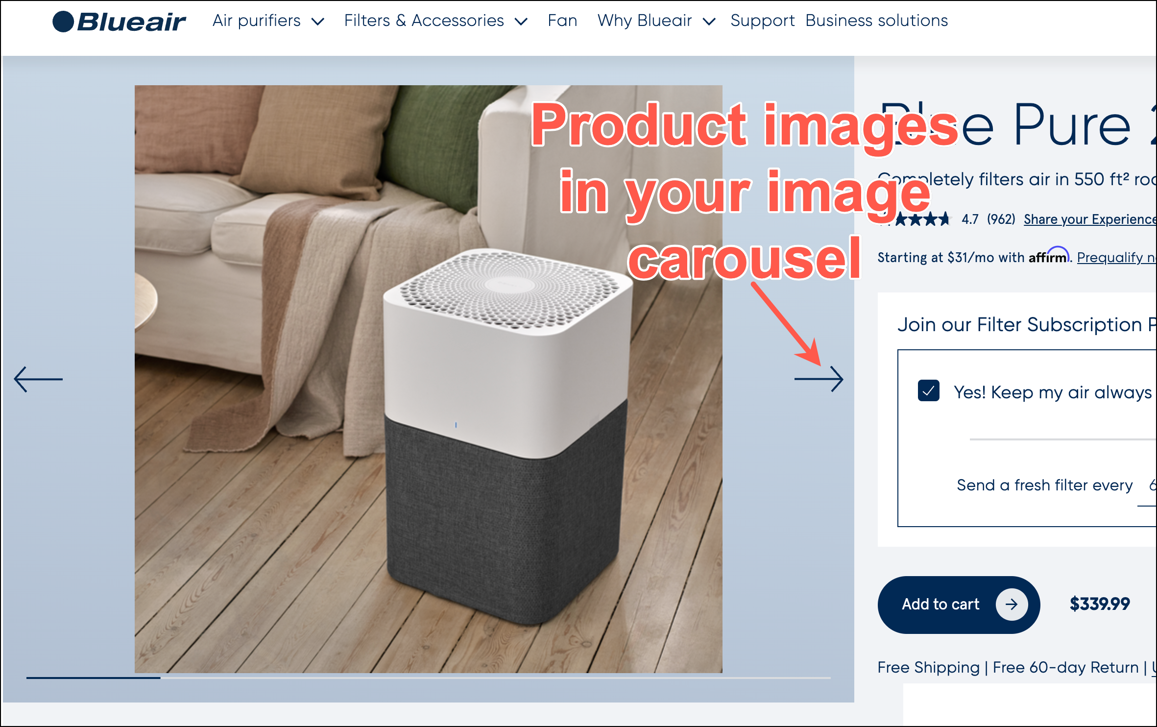
… or customer reviews:
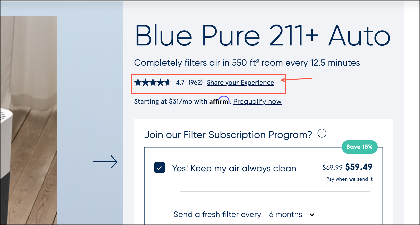
… or anything else you consider important in getting a new buyer to pull the purchase trigger.
A big mistake we marketers make is assuming that if a call-to-action (CTA) is at a prominent location it will be seen 👁 and interacted with.
Shoppers Miss Around 80% Of What’s on a Page
Over the last 14, we’ve seen 100s of heatmaps and user session records for various direct-to-consumer (DTC) sites. These retailers sell very different products at vastly different price points. Yet, the common thread has always been our horror of seeing visitors ignore most of what we placed on the page.
Bryan Eisenberg is my conversion optimization mentor. I once heard him describe online shoppers as beagles on steroids. Bryan is 100% right.
Using conditional elements marketers can ensure critical aspects of their pitches aren’t missed.
But Rishi, how do conditional elements work? Glad you asked.
How Conditional Elements Work
Our goal is to ensure the shopper doesn’t miss a key detail. We do this by conditionally repeating a CTA across the product page. An example– for our client HandicappedPets.com, we created a CTA to draw attention to a special popup message. That CTA was placed at 5 locations across the product page.
You’ll notice the design and message of each CTA are different. This is because different shoppers respond to different messages and we wanted to cast a wide attention net.
First, we added a red banner just below the Add to Cart section:
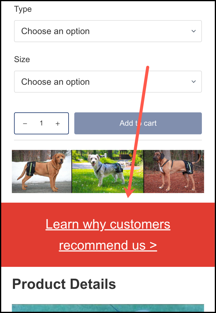
We then added two more CTAs in the Product Details section:
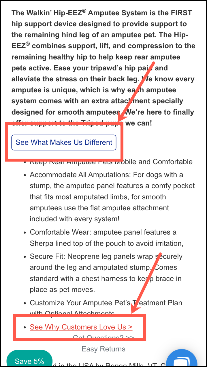
The text in these CTAs changed but the popup content (we’re using the popup to talk about an important detail) was the same.
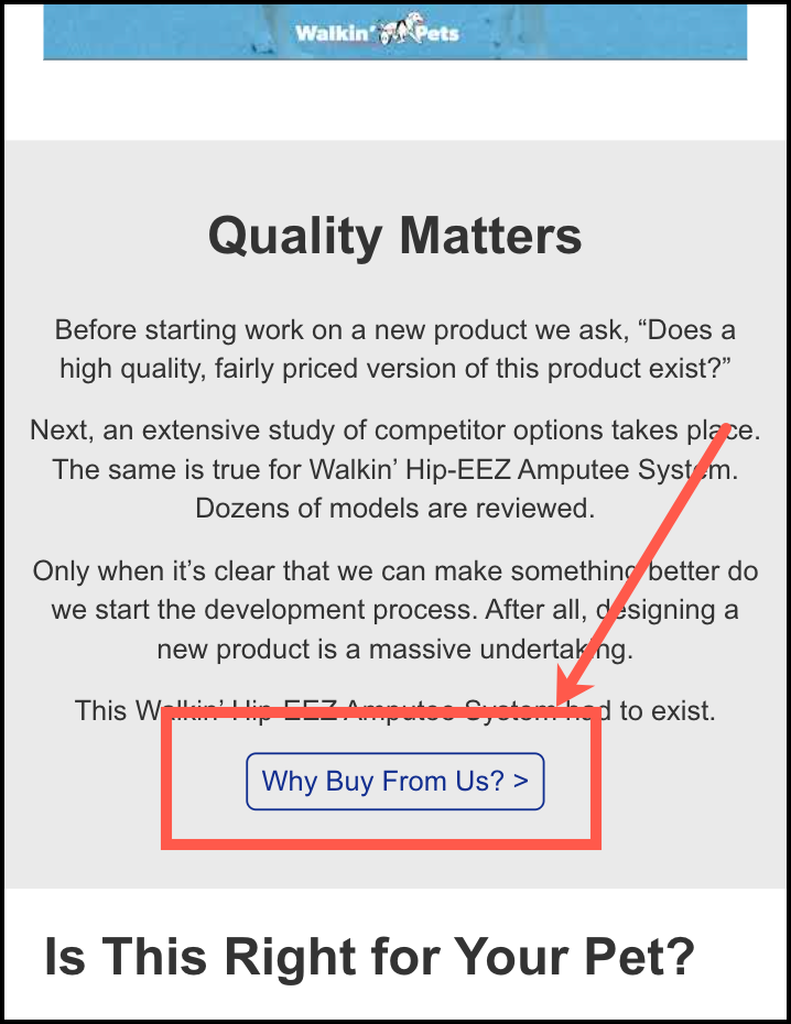
Next, we added a button at the bottom of their Quality Matter section:
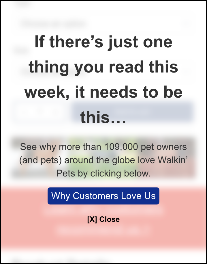
And for people who missed all 4 of the subtle hints above– I’m looking at you Steve– we displayed a frosted glass overlay (imagine a locked screen) at the 40% scroll depth point of the page:
The 5 CTAs described above are conditional. If the shopper clicks any one the remaining ones become invisible (they are hidden using javascript code). But if the shopper ‘misses’ one they will see the second one. If they miss the first and second ones they will see the third one.
This technique maximizes visibility while minimizing CTA repetition.
Does this Conditional Elements explanation make sense? /

Live example here (the page also has an explainer video): https://frictionless-commerce.com/demo.
Conditional Elements Case Study
On HandicappedPets.com we realized that a key detail was their “why we exist” story. So we placed CTAs at multiple locations to draw attention to this content. Those 5 locations have been shown above.
To the client’s surprise, the test generated a 14% sales lift. You can read about it here: How Revealing Your “Why We Exist Story” Can Boost Conversions Sitewide.
Next Steps
My theory is you arrived at this page via our Building An Effective A/B Testing Strategy article. If that’s the case the next stop in your journey is this.
If this is your first visit welcome and continue your journey here:
We’ve spent all our time in our marketing lab, experimenting with online shoppers. We’ve learned a crap ton and are ready to share those learning.
What we’ve learned is that the real secret to growing sales is to ignore 84% of your site visitors so you can triple down on a very special group. We call this group Healthy Skeptics. 👈🏼 click the link to your left for an unfair advantage over the competition.


Comments 11
I loved the newsletter that you have sent today.
ReplyA number of things became more clear after reading the article based on the last question I had asked.
Rishi Rawat
I’m so glad you liked it, Saptaswa.
ReplyExcellent information. I love your idea of showing the Why We Exist (Our Story), in multiple places, but after it is clicked the other instances disappear. That’s really cool!
I am moving off Yahoo store to Big Commerce. Hopefully, it will be easier to create better product pages on BG.
Thanks Rishi!
ReplyRishi Rawat
Move to Shopify. I’m working with Michael Whitaker to build a Shopify Product Page Doctor app (it’s all hush-hush for now). But with the app, you’ll be able to click one button and add the Our Story to the product page. You’ll even be able to rename the button and specify how many times you want to mention it. And, best of all, it’ll hide the other button repetitions when this button is clicked!
The app will also have 7 other KILLER features.
It will embody 13 years of work!
ReplyGreat article! We have the “why we exist story” as a link on our footer nav but you’d have to be looking for it to find it. So many customers love supporting us because of our story so it makes sense to make it more discoverable on the product page. If only there was an app that help with this!
ReplyRishi Rawat
Justin: If only there was an app that help with this!
ReplyRishi: Haha. I’m working really hard to make this a reality. Will keep you posted.
Rishi I’m so glad I’m on your email list, you probably have one of the highest open rates of all the gazillion things I’m subscribed to (and you’re chosen to land in my actual inbox, unlike many 😉 because each post you send round is thought-provoking and informative. this latest one is no different, where you really explained the value of having a direct link to ‘our story’ right on the product pages. I’m excited to see mention of shopify in the comment above as that’s the platform I’m building my shop on. Each time you suggest these subtle but effective tweaks I wonder ‘will I be able to implement that or would
ReplyI need to be on a custom site?’ – look forward to hearing more about the app.
Rishi Rawat
I’m so excited about launching the app. It’ll be a lot of work but clearly worth it!
ReplyAhh, too late. Started the migration back August with Don Cole at Your Store Wizards. At the end of the project now.
Maybe you could build an app for BG?
I haven’t heard from Michael Whitaker in ages! We used to use one of his apps on our site for years.
ReplyRishi Rawat
I’ll build a custom solution for your BG site. But only because I love ya!
ReplyWONDERFUL!!! Very excited!!! Thanks Rishi – you’re the best!
Reply