
Case Studies
Landing Page Conversion Rate Optimization Using Buyer Psychology
- Goal:
- Improve the conversion rate on the main landing page for the wheelchair product category by 20%.
- Outcome:
- 35.68% conversion rate lift on the main landing page for the wheelchair product category.
The Problem
The biggest product category on HandicappedPets.com is their Walkin’ Wheels® pet wheelchairs. This category is responsible for half of their revenue, and the wheelchair has helped more than 112,000 aging and disabled pets live longer and happier lives.
Most of their landing traffic arrives on their main wheelchair landing page, so we knew that if we could focus our attention on dramatically improving conversion rates on this one page, it could have a massive impact on the business.
Since HandicappedPets.com achieved massive success with their Walkin’ Wheels® pet wheelchairs, a number of other wheelchairs entered the market.
Shoppers often have multiple tabs open to compare options. This is why it’s critically important we explain to shoppers what makes us the best choice. If we can’t do that, then we will lose the shopper and the sale.
Before we tested on this landing page, the page didn’t provide a lot of information about who the company is, why they exist, and why their wheelchairs are the best option. This was especially true for the mobile version of the page.
Additionally, the product category can be further split into two more categories: rear leg wheelchairs and full-support wheelchairs. Shoppers were navigating from the main wheelchair landing page to either of those two landing pages, then finally navigating to the product page. We knew this experience could be simplified.
Continue to the next section to see what the old version of the page looked like…
Control
Here is a screenshot of what the desktop page looked like before we started testing.
And here is the mobile version.
Test Concept
At Frictionless Commerce, our main conversion optimization tool is our long-form sales pitch formula. But this test required more than that — we also needed to rethink the structure of the entire page if we wanted to dramatically simplify the user’s experience navigating through the site.
For this concept, we focused on two areas:
1: Improving the story told on the page with a long-form sales pitch
As you saw in the screenshots of the original page (especially the mobile version), most of the content on the page was purely informational.
But this is an emotional product — it’s something that can make a beloved pet’s life so much better, and most pet owners view their pets as part of the family.
That means we needed to craft a story around that while also highlighting the superior build quality that comes with a Walkin’ Wheels® pet wheelchair. Quality is always important, but especially so with medical products.
Typically, we show our long-form sales pitch in a lightbox window/modal that can be accessed through various buttons throughout the target page. But since we were rethinking the entire landing page in this project, we decided to directly embed our pitch on the page.
Below is an annotated screenshot of our concept. Click on the annotations (green and blue numbers) to read the explanations for the copy choices we made throughout the page:

2: Simplifying the navigation
Next, we needed to address the complex navigation that shoppers were required to do to reach the product page. Instead of asking the shopper to navigate from this landing page to another landing page, we added a “Ready to Shop?” section at the bottom of the page. It looks like this:
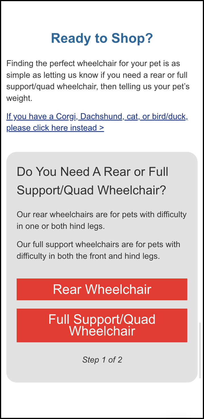
We briefly explain the purpose of the Rear Wheelchair and the Full Support/Quad Wheelchair, then ask the user which one they need. On click, instead of taking the user to a new landing page for the rear or full support category, we ask the user one more simple question, “How Much Does Your Pet Weigh?”:
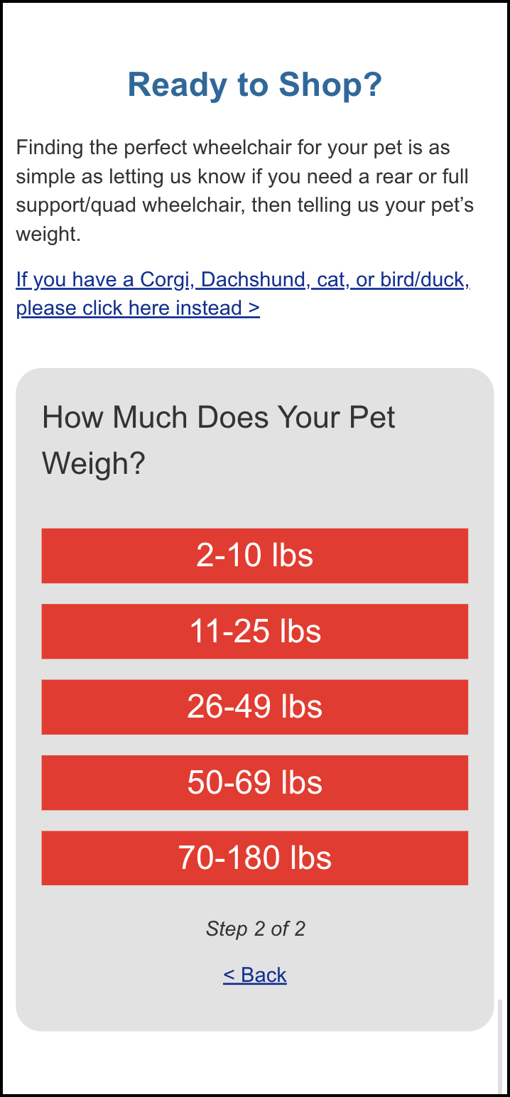
Before, the shopper had three ways to find the wheelchair size they needed: they could select based on weight, they could use a sizing chart, or they could use a fit calculator. We decided to simplify this by giving the shopper one option (multiple options can often hurt conversions).
When the shopper clicks on their pet’s weight in the second step shown above, they’re taken directly to the product page for the size their pet needs.
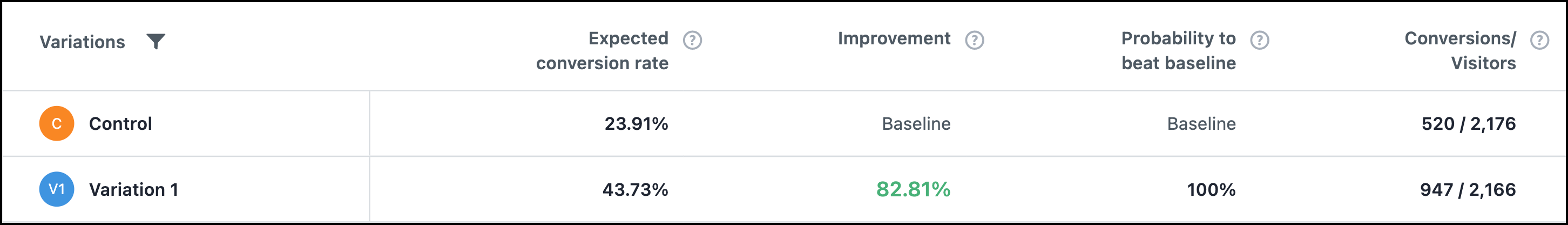
As a result, our test variation saw an 82.81% lift in visits to the wheelchair product pages:
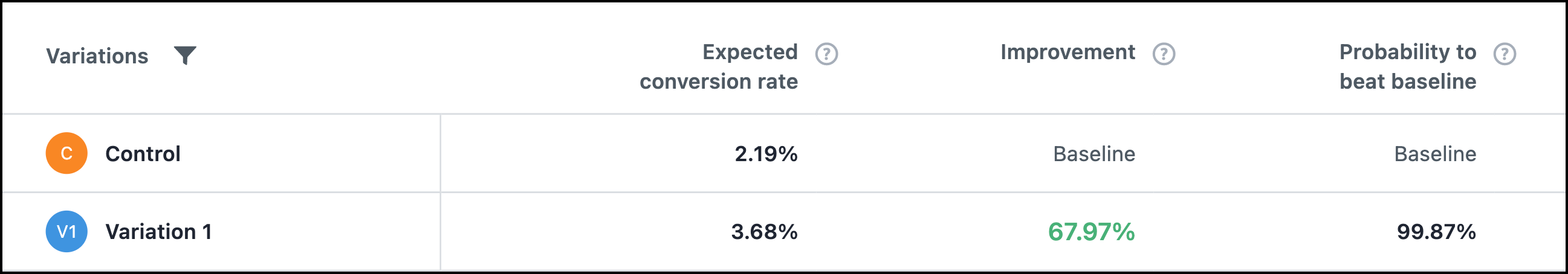
Additionally, there was a 67.97% lift in clicks on the add to cart button on the wheelchair product pages:
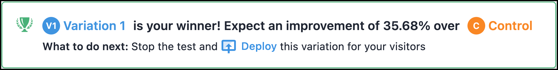
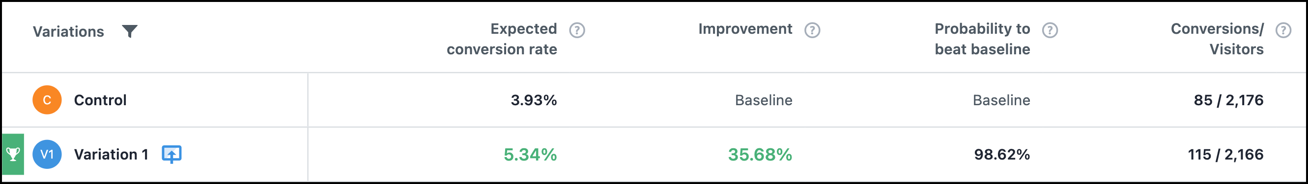
Outcome
Our original goal was to generate a 20% lift on this landing page. Instead, we saw a 35.68% lift:
Why Our Concept Won
We believe this test won because we focused our story our quality and emotion, allowing the shopper to be less price sensitive. We also dramatically simplified the navigation experience, which brought many more shoppers to the product pages and cart/checkout funnel.
More Evidence
%
Tiege.com was already doing really well. They wanted to see how much further test to paid search landing page could be pushed.
Read Case Study%
Stix is on a mission to disrupt the golfing game. Consumers don't just buy a new golf club. A lot goes into that purchase.
Read Case Study%
Glemnetic.com is a leader in its space. We wanted to see if we could push conversion rates higher.
Read Case Study%
This client's viral video was driving a ton of traffic to their bestseller page. Our job was to convert that traffic...
Read Case StudyARE YOU OUR NEWEST CASE STUDY?
We are laser focused on the type of client that our methodology and skills will give the highest return on investment and so if you meet our criteria for taking on new projects, we are confident you will see results like these.


