
Case Studies
Buyer Psychology Marketing Case Study
- Goal:
- Improve bestseller category sales by 15%
- Outcome:
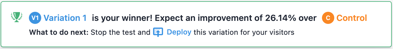
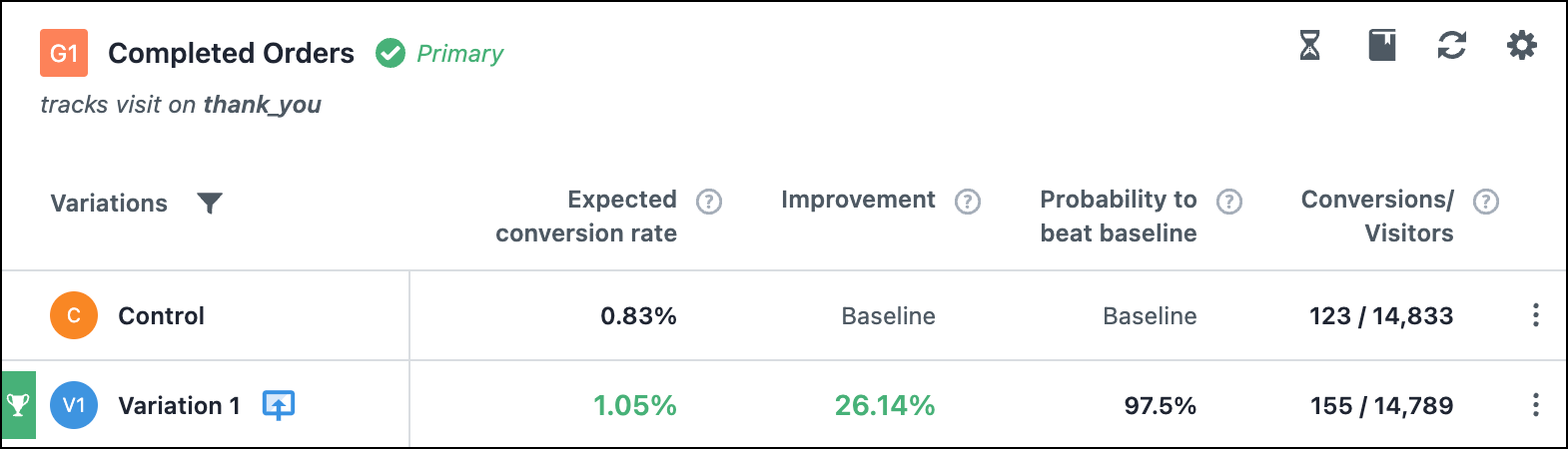
- 26.14% increase in conversion rates. This is what Mike said 👇🏼

The Problem
Selling a golf set online is really hard. Most consumers are used to buying a set at a store where they get to have a chat with a PRO who guides them.
Add to this mix the challenge of buying a golf brand the shopper likely hasn’t heard of before and suddenly the problem becomes even more challenging.
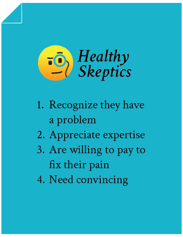
Like with all our case studies the bulk of our conversion focus is one group: Healthy Skeptics.
We like Healthy Skeptics because they are close to making a purchase. This means with just a little nudge we’ll be able to send them past the finish line.
Healthy Skeptics have 4 qualities:
We think you’ll like this short marketing case study.
Test Concept
When marketers study a page we typically conclude many aspects are important. The trouble with this is that it diffuses the marketer’s attention. And it’s hard to focus when we’re looking at a whole bunch of things.
As we studied this product page (image), we wondered, “if we could pick just 4 elements, which would we pick?”
We concluded that the 4 things that mattered to us were:
1: Price Justification
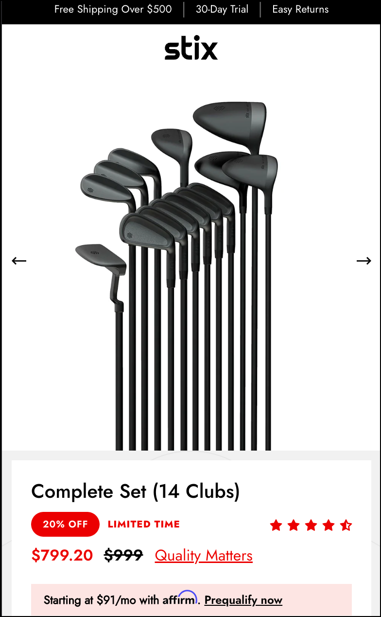
While these clubs cost way less than big brand clubs, spending $799 on a set is still a big deal, and Healthy Skeptics want to be sure they are getting good value for money. We know from eye-tracking studies that shoppers focus on price, and price activates anxiety. So our simple idea was to add a call-to-action right next to the price so that shoppers who felt anxious would get the answer they were seeking right there and then.
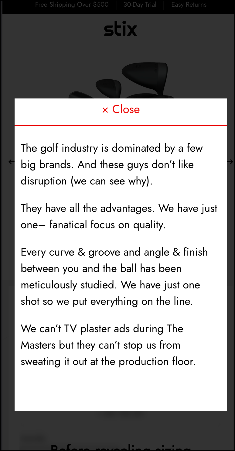
Here’s the call-to-action we added (Quality Matters link below):
And this is what is shown when the Quality Matters link is clicked:
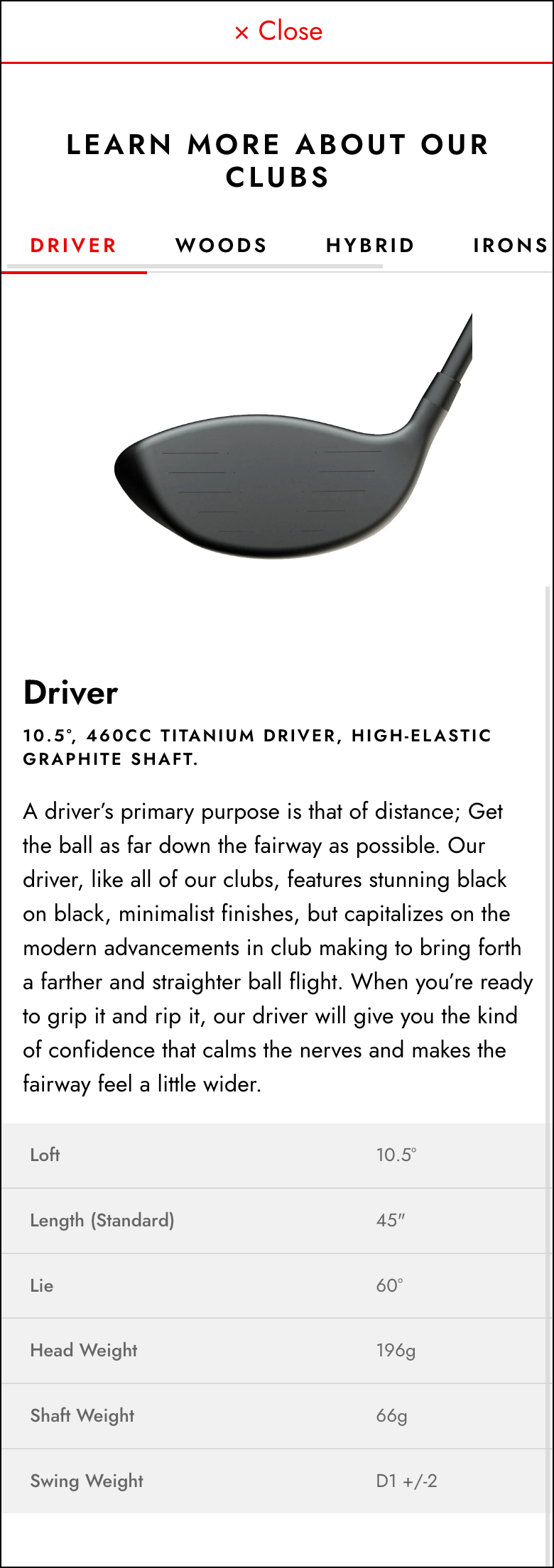
2: Clubs Included With the Purchased Set
The details about the individual clubs in the set are shown lower on the page. For mobile users, this was 5 mobile pages down. We wondered: what would happen if we made this content more visible by bringing that content near the top of the page?
So we added a call-to-action here (pointed out by the red arrow below):
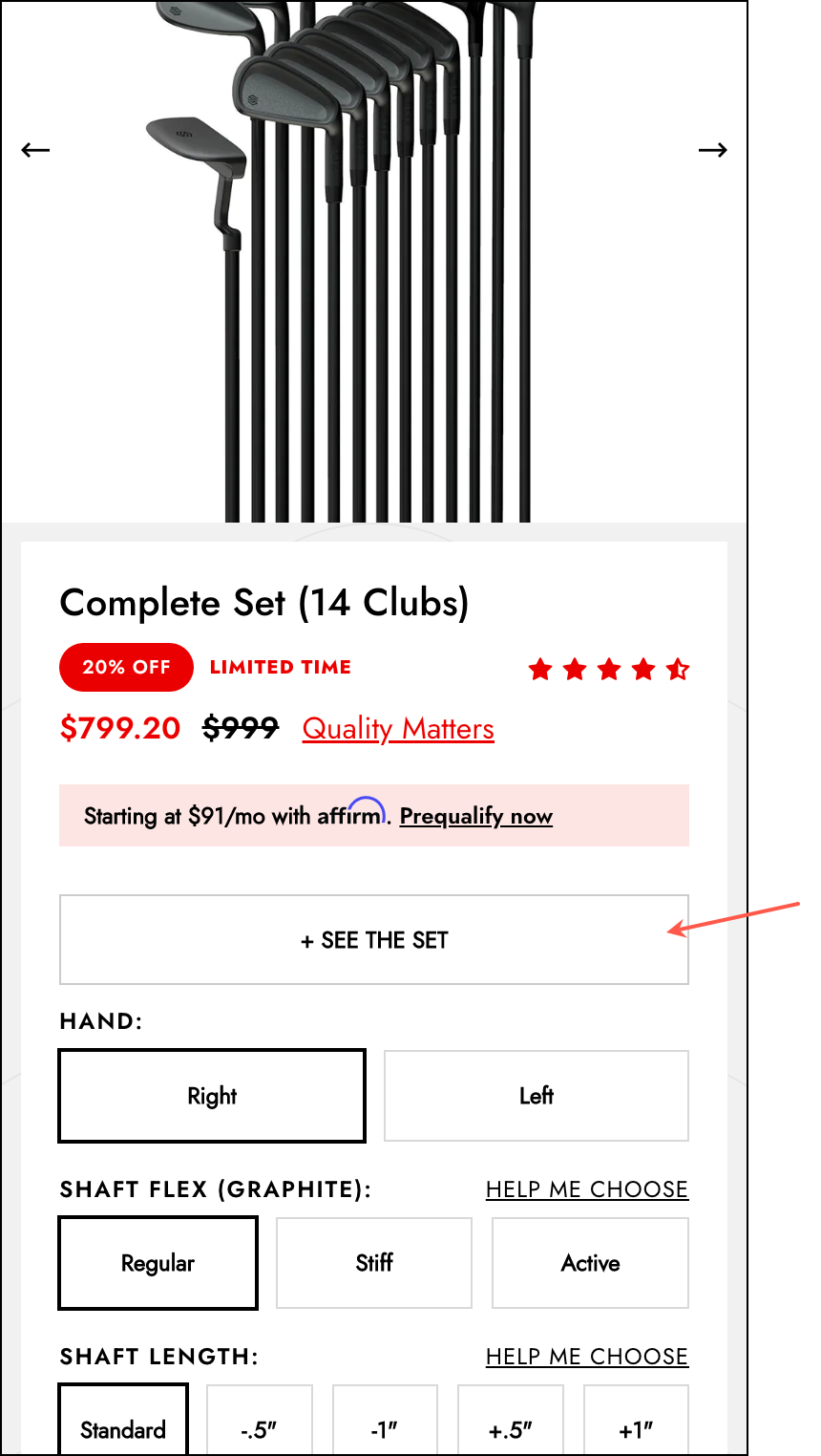
And on click– instead of scrolling the shopper down to page 5 where that content is shown– we showed it as a lightbox popup at their current location:
3: Video Content
The shopper on Stix didn’t just have one hurdle (choosing the right set) they also had a second one (knowing if they trusted a brand they had never bought from). Luckily, the client had an excellent video that showed the brand story and their focus on design. You can see it here:
The trouble was this video lived on page 4 of the mobile page and wedged between two important sections. It was likely that many buyers missed it. So our simple idea was to 3x the video visibility by adding it to the top of the long-form sales pitch.
4: Long-Form Sales Pitch
Most people who come to this page want a quick explanation and are then ready to buy. But others want more. We call these people Diggers. And Diggers are Healthy Skeptics, which means that while they value expertise and are willing to pay for it, they need convincing. For these people, we constructed a long-form sales pitch.
Using a long-form sales pitch to draw out Healthy Skeptics is our go-to move. But we typically do it by adding subtle conditional elements. However, in this test we blocked the product page description and added a frosted glass overlay:
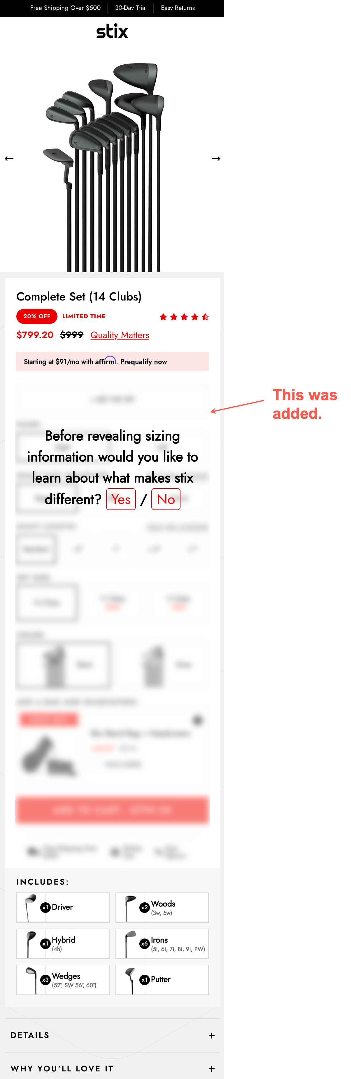
This had a profound impact on the discovery rate of our long-form sales pitch. Where the subtle nudges generate a discovery rate of around 10% this frosted glass increased the discovery rate to over 40%. That 4x’es the speed of the text.
We can now very quickly determine if Healthy Skeptics love, hate, or are indifferent to our pitch.
When No was clicked (see the frosted glass screenshot above) we immediately removed the frosted glass and got out of the way (the shopper was clearly signaling their preference by clicking No).
But those who clicked Yes were shown a lightbox popup. Click on the annotations (green and blue numbers) to read the explanations for the copy choices we made in the lightbox the visitor sees.

Were the copy choices in our sales pitch clear? /

Fyi, the pitch shown above was constructed using the nine truths about online shoppers.
Outcome
Why Our Concept Won
It’s easy to get lulled into believing that everything on a page is important. It’s not. Triple down on the few things that truly matter.
More Evidence
%
Tiege.com was already doing really well. They wanted to see how much further test to paid search landing page could be pushed.
Read Case Study%
Stix is on a mission to disrupt the golfing game. Consumers don't just buy a new golf club. A lot goes into that purchase.
Read Case Study%
Glemnetic.com is a leader in its space. We wanted to see if we could push conversion rates higher.
Read Case Study%
This client's viral video was driving a ton of traffic to their bestseller page. Our job was to convert that traffic...
Read Case StudyARE YOU OUR NEWEST CASE STUDY?
We are laser focused on the type of client that our methodology and skills will give the highest return on investment and so if you meet our criteria for taking on new projects, we are confident you will see results like these.


