
Case Studies
Using Buyer Psychology to Boost Conversions
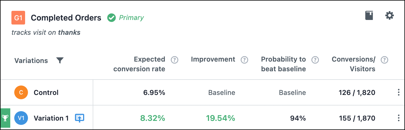
- Goal:
- Explore to see if it’s possible to improve bestseller sales.
- Outcome:
- 19.54% increase in conversion rates. Testimonial video 📹.
The Problem
Historically men haven’t taken very good care of their skin. Tiege has been on a mission to fix that. The page we worked on is their top landing page and receives a ton of ad traffic. Ad traffic is notorious for bouncing. On top of that, we’re selling a skin care system that requires a long-term commitment.
Control
Here is a screenshot of what the mobile page looked like before we got started.
Our Conversion Optimization Philosophy
We do something controversial. We ignore 84% of site visitors and triple down on a very specific group we call Healthy Skeptics.
If site visitors are arranged into concentric circles the innermost circle represents your current conversion rate. These are people who are currently buying from you. Any resistance these folks experienced was overcome by your current sales pitch.
Next is an area that represents shoppers who were affected by your gravitational pull and came close to converting, but the pull just wasn’t strong enough to get them over the finish line 🏁.
These are Healthy Skeptics.

There exist concentric circles beyond Healthy Skeptics but the energy needed to convert those bands is very high (maybe even prohibitively high).
Does this make sense? /

By contrast, Healthy Skeptics need just a little more convincing. Therefore, spend all your energy on them.
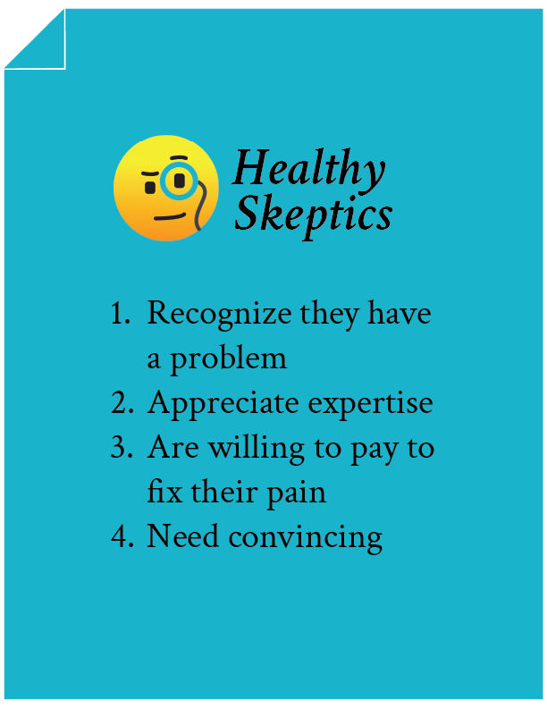
Qualities of a Healthy Skeptic
There are 4:
Now that’s out of the way let’s return to our test concept.
Test Concept
As an agency, we’re known for improving conversions using our long-form sales pitch formula to convert Healthy Skeptics. But that doesn’t mean it’s the only tool in the toolkit. When working on a client project we bring everything to the table.
For this particular mission, we focused on two sets of ideas.
Set 1: Improvements to the Default Page
One doesn’t need to make massive changes at the get-go. Don’t use a hammer when a scalpel will do just fine. So we first started by making a number of micro-improvements (article about micro-improvements) on the page. Here were some of the micro-improvements:
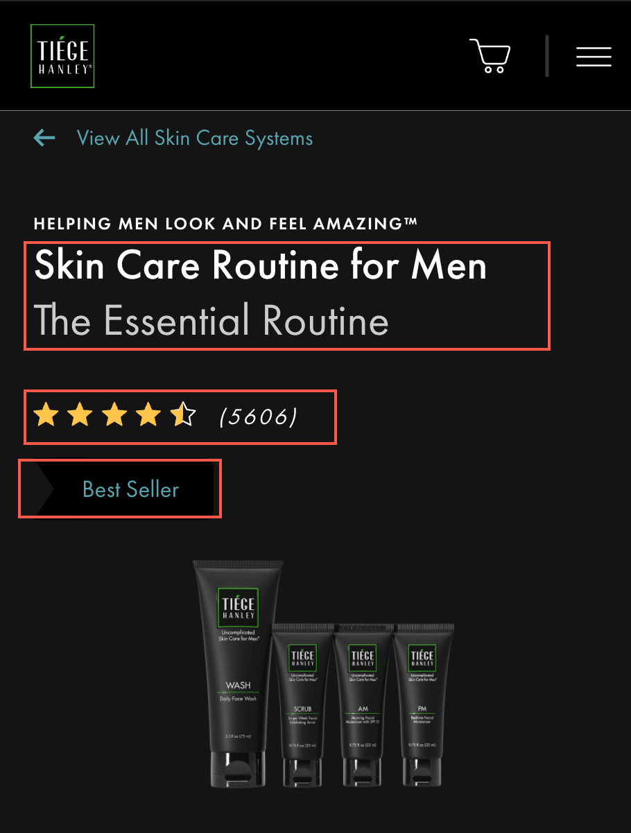
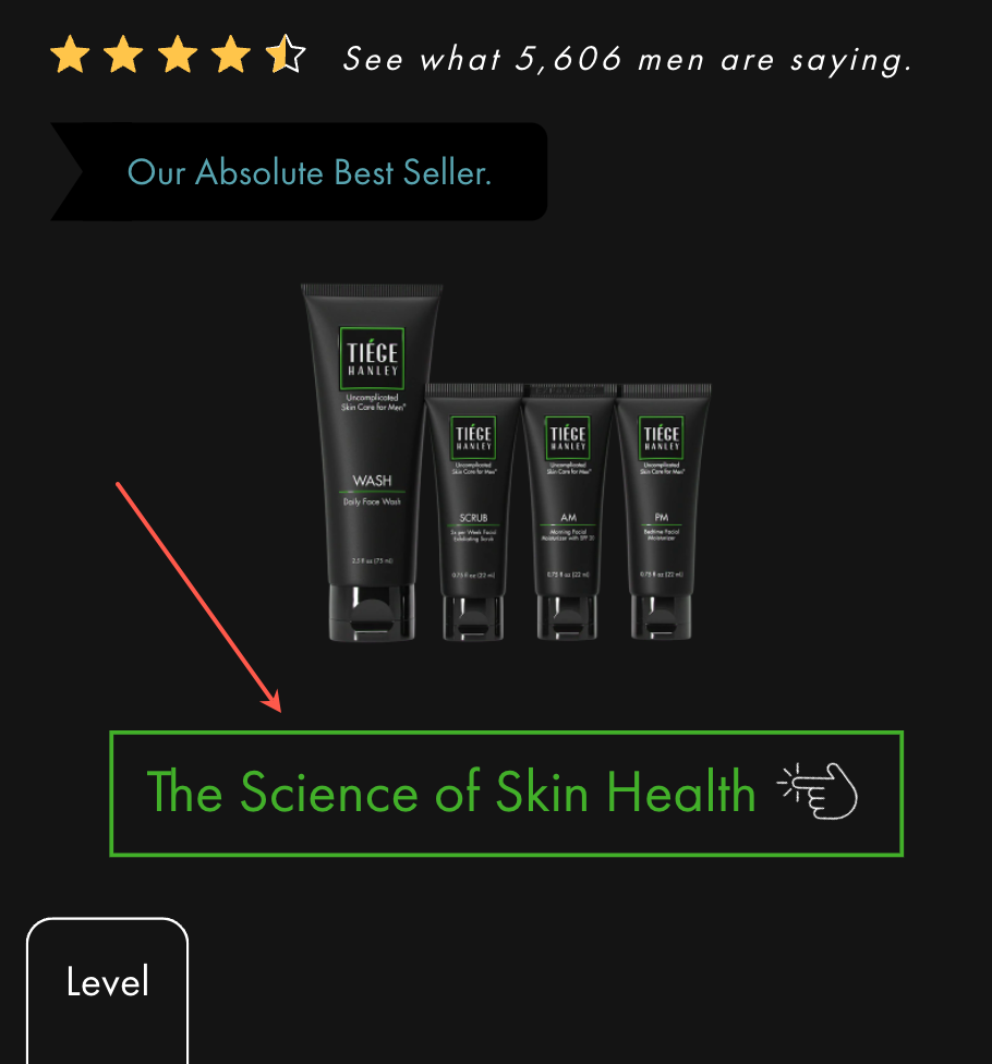
1: You’ll notice the original page displayed product name, review counts, and best seller label (highlighted in 3 red boxes in the image below):
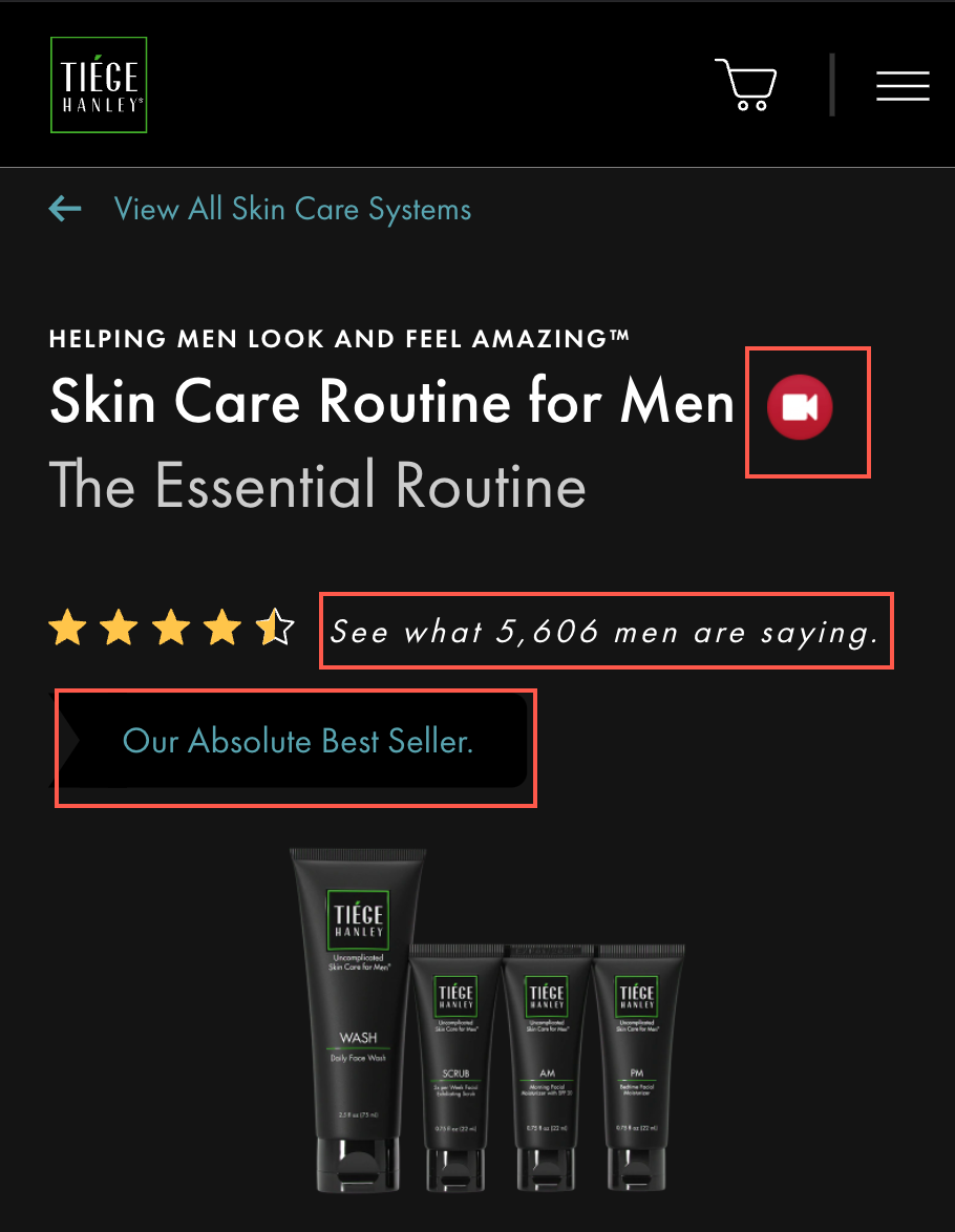
In our concept, we updated these 3 elements by adding a video right next to the name (we did this because new visitors might not know about this item and the video did an excellent job showing that), we added a little more copy around the reviews to draw more attention to them, and we dramatized Best Seller to Our Absolute Best Seller.:
2: On the original page the 3 systems were shown this way:
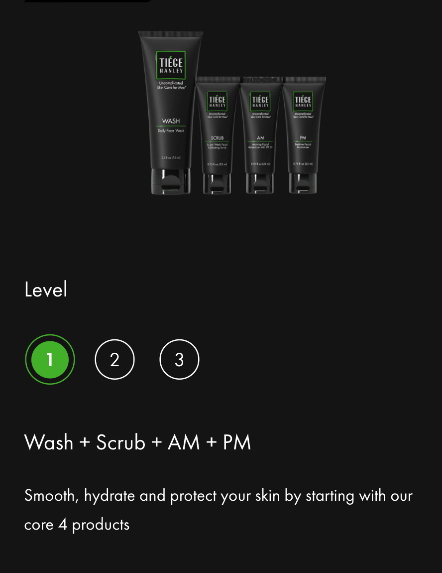
We felt some visitors might not realize they needed to click 2 and 3 to see those systems so we added a small visual cue. See A in the red circle in the screenshot below:
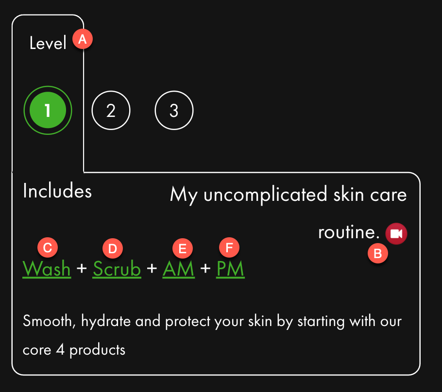
But that’s not at all what we did. Have a look at the other lettered red circled items:
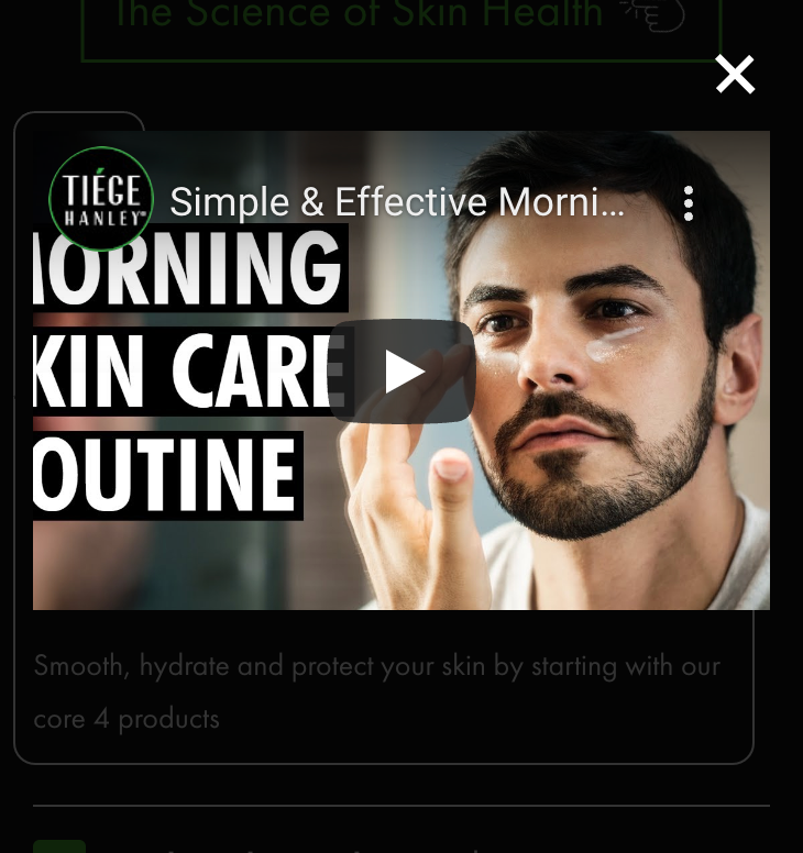
B– We were fortunate that Tiege has videos for each of the 3 system levels. Since the user is currently sitting on Level 1 we thought it was a good idea to show a video that talked about Level 1. Clicking the red video icon showed a video as a lightbox:
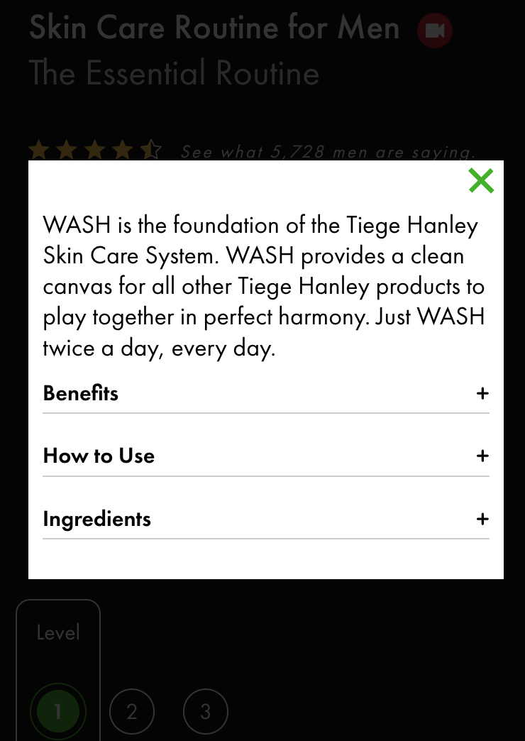
C, D, E, F: Lower on this page the user would find content that explained each of the items included per system and how to use them. Our thinking was, that the mention of that item is happening at this location, so why not also educate the buyer at this location? If Wash is clicked we showed this lightbox content:
3: On the original concept clicking this money-back guarantee link took users to a money-back guarantee page:
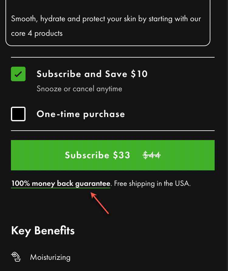
Our strategy is to always keep the user on the same page so in our concept we showed a lightbox when the money back guarantee link was clicked:
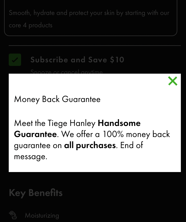
We also made the message more impactful by adding an End of message sentence.
4: If you see what we did to the reviews section you might be a little surprised:
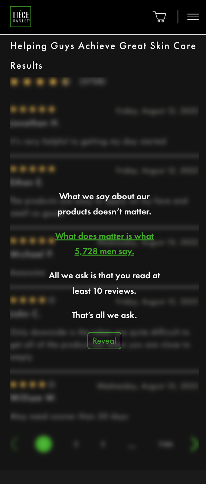
You might be thinking it’s weird that we are hiding reviews. But this is being done to influence buyer psychology. Here’s what we know– 54.7% of consumers read at least four reviews before buying a product (source). So our thesis was: what would happen if we used a priming technique to get visitors to read more reviews than they normally would?
Alright, so those were the micro-improvements we made to the page. You’ve experienced the appetizer, now enjoy the entree.
Set 2: Long-form Sales Pitch
Most product pages are short and to the point. This works really well for the majority of buyers. But Healthy Skeptics, the group we specialize in influencing, needs more info.
We don’t like adding too much more content on that page because that could be a turn-off for most buyers. So here’s what we do, at strategic locations we conditionally add a cue so Healthy Skeptics can self-select themselves. On this page we added those cues at two locations:
The idea is to be subtle, we don’t want to have the call-to-action CTA be so loud that it forces people to interact with it. It should be subtle enough so the audience we’re trying to attract notices it. This is why we mention the CTA conditionally a few times on the page. If you want to understand the full philosophy behind long-form sales pitch techniques read this post: Write Your Long-Form Sales Pitch.
When any of the two CTAs mentioned above were clicked the user was shown this sales pitch.
Click on the annotations (green and blue numbers) to read the explanations for the copy choices we made in the lightbox the visitor sees.

Were the copy choices in our sales pitch clear? /
Outcome

Two notes:
Note 1: We would prefer to be wrong versus making a wrong selection. Since this test had only run for 2 weeks we reran it. The follow-up test also won.
Note 2: It would be irresponsible to make it sound like getting a test winner is a sure thing. The name of this test was R1C1A8. The 8 in A8 stands for the 8th attempt. That means our first 7 tests failed to move the needle. And the next 5 tests after this also failed. So 13 attempts over 90 days to get 1 winner. Is it worth it? This is the client’s flagship product so in this situation, yes.
CLIENT TESTIMONIAL
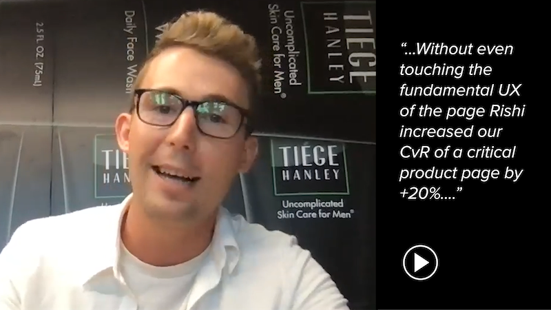
“Rishi gets the job done! Rishi uses his tool kit – buyer psychology and copywriting – to address key purchase friction points. Without even touching the fundamental UX of the page Rishi increased our CvR of a critical product page by +20%. His measurement methodology was thorough as he cross-referenced VWO A/B testing with GA data to ensure we saw the corresponding impact. My suggestion is let Rishi do his thing! The ROI can be outstanding.”

Thomas Robinson
Director of Growth
Tiege Hanley
Why Our Concept Won
Because we first made a list of all the questions of questions and objectives a guy would have for not committing to a skin care routine. We then constructed an argument to bust each of those objections. Just like a lawyer or debater.
More Evidence
%
Tiege.com was already doing really well. They wanted to see how much further test to paid search landing page could be pushed.
Read Case Study%
Stix is on a mission to disrupt the golfing game. Consumers don't just buy a new golf club. A lot goes into that purchase.
Read Case Study%
Glemnetic.com is a leader in its space. We wanted to see if we could push conversion rates higher.
Read Case Study%
This client's viral video was driving a ton of traffic to their bestseller page. Our job was to convert that traffic...
Read Case StudyARE YOU OUR NEWEST CASE STUDY?
We are laser focused on the type of client that our methodology and skills will give the highest return on investment and so if you meet our criteria for taking on new projects, we are confident you will see results like these.


