
Case Studies
How Glamnetic Used Conversion Copywriting To Optimize Category Sales By 20 Percent
- Goal:
- To improve sales for the eyelash category. Not just one eyelash page but the entire category. This example is for eyelashes, but the conversion copywriting technique used can be applied to any site. That’s the whole point.
- Outcome:
- 20.74% increase in category sales.
The Problem
There were 2:
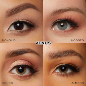
1: Eyelash extensions are a very visual product (the visuals do the selling so using copy for conversions is hard [but not impossible, as you’ll see]):
2: Glamnetic is primarily known for magnetic lashes, while glue-on lashes are the more well-known product. Especially with a higher price point, we needed a compelling pitch to get users to switch. Getting people to change habits is hard.
Control
Here is a screenshot of what the mobile page looked like before we got started.
You’ll see the page is very simple. Nice product image gallery, short and to-the-point description, an upsell, and reviews (lots of reviews).
Keep in mind this page format was already working really well for the client. Being simple was a conversion driver.
Test Concept
If you’ve seen our case studies, you know we have a very predictable formula, which is we place subtle nudges across the funnel, and when people who lean in with interest, our most important audience, we show our personalized sales pitch in a lightbox.
The most common question marketers ask is, “Rishi, if your pitch has a good conversion impact, why do you make people click to see it? Why not just place it on the page for everyone to see.”
That’s exactly what we did for this test on Glamnetic
Test Concept
While we sometimes target just one page (the bestseller), for this test, we targeted an entire category. This means if you were part of our test and went to any of the targeted eyelash pages, you’d see our concept.
Step 1: Add Nudges At High Visibility Locations
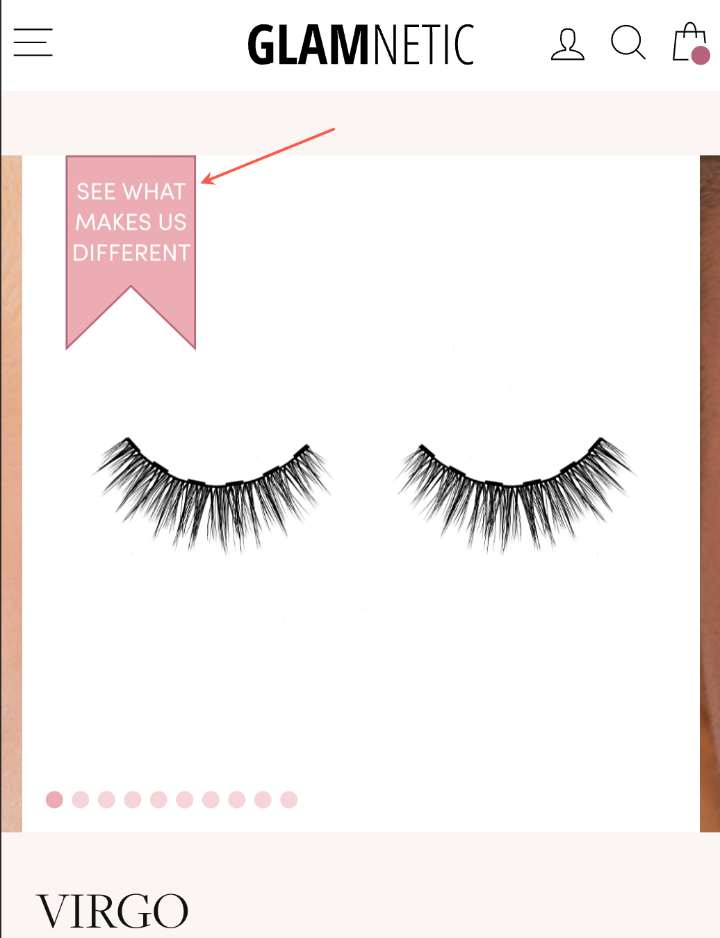
The image gallery is the most viewed section on a product page, especially for a page selling a highly visual item. So, we added our nudge at the top left corner of the first image in the image gallery:
But what is someone missing, seeing it, and quickly moves to the next image in the gallery? If our nudge was just on the first image, we might miss the change with this shopper. So we also repeated it on the second image in the gallery but only for people who didn’t click the nudge in the first image:
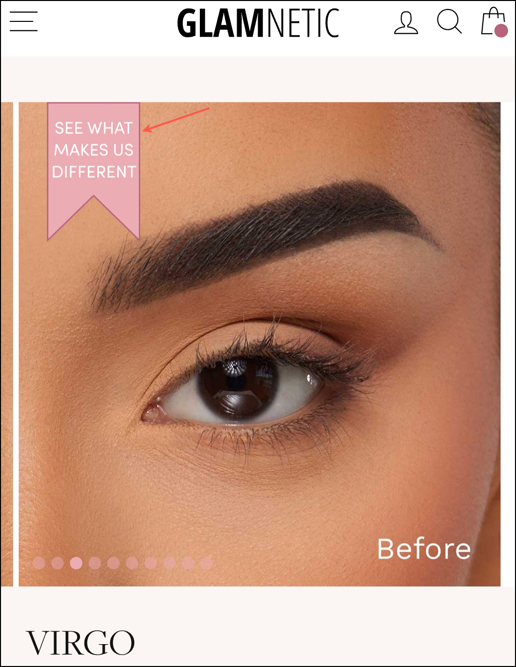
But what if someone missed it in the first image and the second image (they might not be looking at that corner of the image)? To cover all bases, we also added a nudge to the 3rd image in the image gallery:
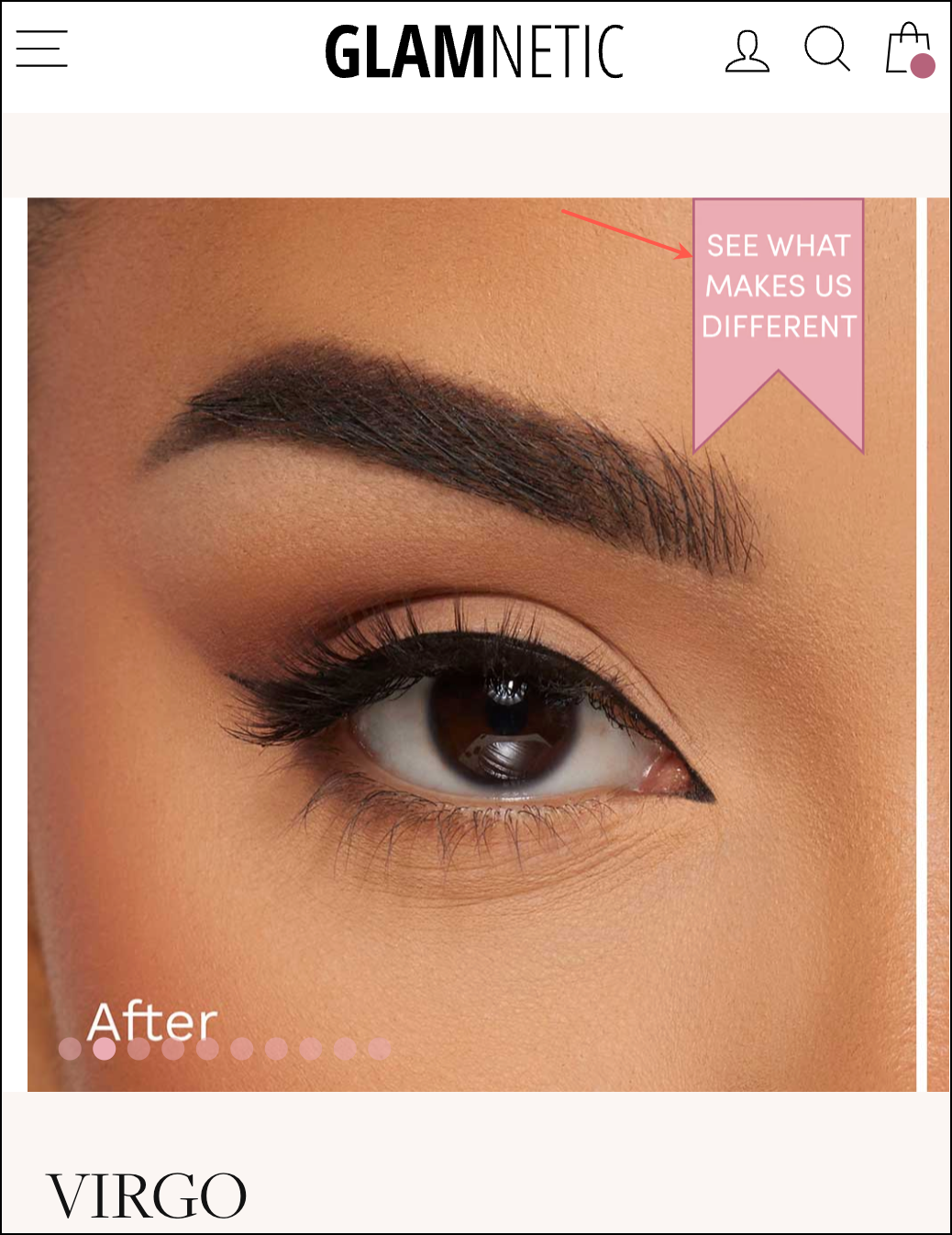
At this point, we’ve covered all bases in the image gallery. But what if the reader ignores all the images and goes to the KEY FEATURES section? That section is visually separated from the image gallery, so it seemed like a good idea to add a subtle nudge right after the short product description.
Note: the nudge shown above is conditional. If a shopper clicks on any of the nudges in the image gallery, this link will immediately made invisible. This does something powerful: it maximizes the probability of a shopper seeing one of our nudges while eliminating the possibility of someone clicking the first nudge, seeing our pitch, and then clicking the second nudge and seeing the same content again. That would be a poor user experience.
Set 2: The Sales Pitch
When the shopper clicks on any of the 4 nudges shown above, they are scrolled down to this section of the product page, where they see our embedded sales pitch. It’s embedded right below the upsell module:
Here is an explanation (below) for all the copy choices we made. If you are seeing this article on your 🖥️, click the image below to see the zoomed view. On 📱, you can pinch and pull the image (clicking it locks the pinch-and-pull mobile feature):

Outcome
I don’t have the client’s permission to share full test data because that would also reveal sensitive financial information. But what I can tell you is that our concept ran for 2 months and lifted conversions by 13.93% and revenue by 20.74% (with 98.4% statistical significance).
Note: To be sure these numbers were accurate, I had the data science team at VWO.com analyze the numbers. The test was only stopped once that confirmation was provided.
Why Our Concept Won
Most visitors to this page already know about Glamnetic. They have either seen a friend use the product or seen an influencer use it. They don’t need a detailed exposition of what makes the product great. The brand also has a ton of reviews. And while this applies to a huge variety of their site visitors, it doesn’t satisfy everyone. Some people want more. This test proves that when those people are provided with the right information, they convert.
More Evidence
%
Tiege.com was already doing really well. They wanted to see how much further test to paid search landing page could be pushed.
Read Case Study%
Stix is on a mission to disrupt the golfing game. Consumers don't just buy a new golf club. A lot goes into that purchase.
Read Case Study%
Glemnetic.com is a leader in its space. We wanted to see if we could push conversion rates higher.
Read Case Study%
This client's viral video was driving a ton of traffic to their bestseller page. Our job was to convert that traffic...
Read Case StudyARE YOU OUR NEWEST CASE STUDY?
We are laser focused on the type of client that our methodology and skills will give the highest return on investment and so if you meet our criteria for taking on new projects, we are confident you will see results like these.


