
Case Studies
Conversion Copywriting: How One Section Lifted Overall Sales
- Goal:
- Improve sitewide conversion rates for CanvasPrints.com.
- Outcome:
- 8.42% increase in overall conversion rates.
Note: this is the outcome of one test. Over a 90-day project, dozens of tests are run. The total lift of those tests adds up to 20% or more.
- 8.42% increase in overall conversion rates.
The Setup
Typically, we focus our persuasion energy on just one product page. Sometimes, clients don’t have one big seller. They have many products driving overall sales. That was the case with CanvasPrints.com.
They have four product categories with multiple skus within each category. So we couldn’t target just one product page. As a result, our test was designed so people who were part of our experiment (randomly selected of course) would see the test element no matter which product page they ended upon.
The Problem
Over the last decade, digital photography has exploded. With it, so have services in the photo printing space. It’s a highly competitive market:
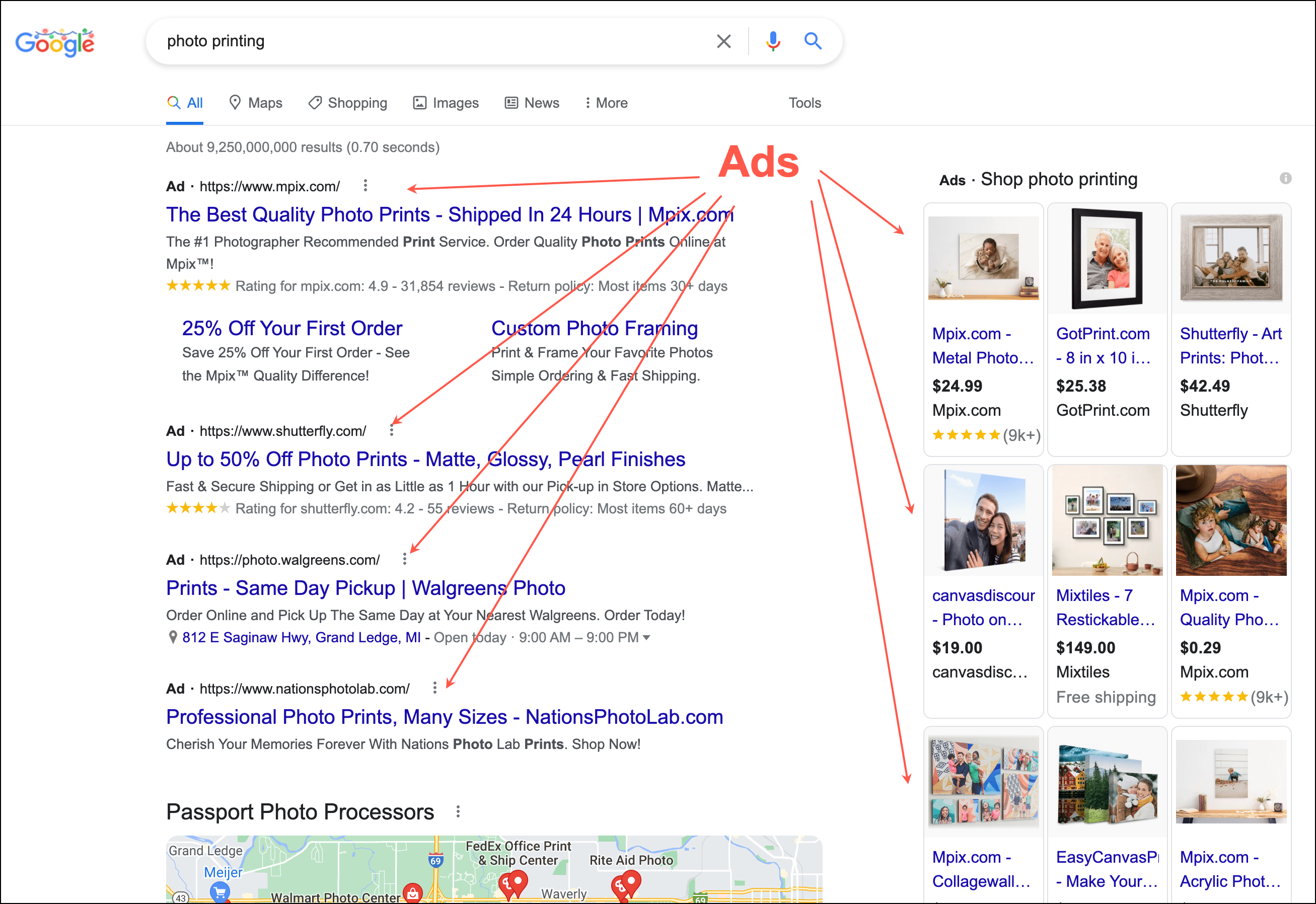
With so many choices shoppers enter CanvasPrints.com with four open tabs. They are in a highly promiscuous state.
If we can’t convincingly communicate who we are and how we’re different they will leave.
Control
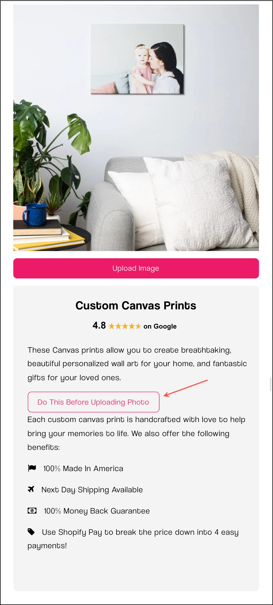
CanvasPrints.com was doing what most brands do— nudging shoppers to the product page, and once there asking them to upload their photos and checkout.
The Concept
16 years of A/B testing have made clear that before shoppers are ready to buy they need to be sold on what makes us different. We need to first help new visitors cross the unfamiliarity barrier: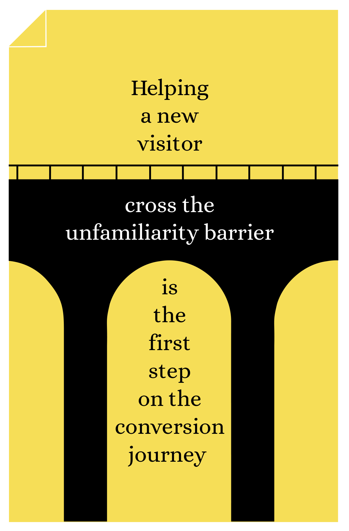
To do this we crafted our “why we exist” pitch— this is where we’re selling the buyer on how we’re different from all the other canvas photo printing options out there.
Next, we had to place this “why we exist” pitch at a high-visibility location. We ended up placing the “why we exist” CTA on ALL the product pages:
Who the “Why We Exist” Pitch Is For
If site visitors are arranged into concentric circles the innermost circle represents your current conversion rate. These are people who are currently buying from you. Any resistance these folks experienced was overcome by your current sales pitch.
Next is an area that represents shoppers who were affected by your gravitational pull and came close to converting, but the pull just wasn’t strong enough to get them over the finish line 🏁.
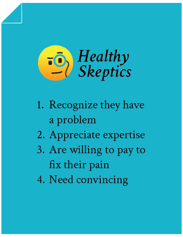
These are Healthy Skeptics.

There exist concentric circles beyond Healthy Skeptics but the energy needed to convert those bands is very high (maybe even prohibitively high).
By contrast, Healthy Skeptics need just a little more convincing. Therefore, spend all your energy on them.
Does this explanation for why it makes sense to target Healthy Skeptics make sense? /

Qualities of a Healthy Skeptic
There are 4:
Now that’s out of the way let’s return to our test concept.
I know some of you prefer reading and others like video content. So we’ve created both.
Video Explanation of Sales Copy
Did the video explanation help? /
Written Explanation of Sales Copy
Click on the annotations (green and blue numbers) to read the explanations for the copy choices we made in the lightbox the visitor sees.
 + The first thing we need to do is acknowledge the competition. It’s silly to pretend our shopper isn’t aware. + Then we need to quickly establish our mission: to be the lowest-priced destination. We picked this selling angle because it’s what emerged in our client interrogation session. + We want to make our pitch feel conversational. Here we’re using that conversational tone to present our philosophical quest. + While consumers are drawn to the low price they also don’t want to compromise on quality. So we’re making our stance on quality clear. + People will be like, “yeah right, how is it possible to have the lowest price and best quality? This is BS.” Our statement was added to address this. Also, we’re letting shoppers know it’s really bloody hard to balance both price and quality. + Here we’re dramatizing just how hard it is to get these details right. + We’re letting the reader know how seriously we take this task: the whole team is involved. + Acknowledging that there is a lot of competition but we study the heck out of it. Buyers want to know we’re on top of our game. + We’re constantly improving. Never satisfied with the status quo. + We’re investing in the best technology. + We’re not scared to invest in something that’ll deliver a superior product. + Acknowledging the question on the shopper’s mind. + Being transparent and letting them know we’re losing profits in the short term. + Here we’re explaining why we’re willing to lose money in the short term: so you spread the word for us. That’s what we’re getting in return— free advertising. +
Before we talk about point #15 I’d like to draw your attention to the line above it. It reads:
Many canvas sites use 100% polyester. We totally respect their point of view because polyester is cheaper.
This is a very intentional statement. We call this softening. The buyer expects us to bash the competition. We surprise them by being empathetic. That empathy translates into an appreciation for us.
Okay, now back to point #15.
Here we’re demonstrating expertise.
+ Here also we’re demonstrating expertise. Shoppers don’t know what these terms mean, but they feel good knowing they’re doing business with a firm that does. + Letting the buyer know that even details that aren’t visible matter to us. Again, this is demonstrating mastery of our craft, something the shopper will appreciate. + Letting the shopper know that their choice today matters. Framing it as a philosophical choice. + Letting them know that we’re just a company that loves doing the work. + We wanted to create a space for the shopper to interact with us. Anytime you have a chance to make the pitch interactive, do it. + Wrapping the pitch by showcasing charitable work. This perfectly fits with the environment created in our sales pitch. It’s the perfect close.
This copy was constructed using a long-form sales pitch formula that’s taken 16 years to develop and fine-tune.
Were the copy choices in our sales pitch clear? /
Outcome
13.8% of site visitors interacted with our {Do This Before Uploading} button.
The test was exposed to 17,921 visitors and recorded 1,447 orders when the statistical winner was declared. The lift was 8.84%.

Confession
We cheated—we didn’t test just one sales pitch. We tested 5 different flavors. Each with a distinct point of view. The goal was to find the one with the greatest revenue lift.
Now that we have a winner we’re going to experiment with even more enhancements to the sales pitch.
It’s an ongoing process. We once worked on a client project where we ran experiments on just one page for over 2 years. By the end of the project, we had doubled conversions.
More Evidence
%
Tiege.com was already doing really well. They wanted to see how much further test to paid search landing page could be pushed.
Read Case Study%
What's better than a sales pitch that converts? A personalized sales pitch that converts.
Read Case Study%
Stix is on a mission to disrupt the golfing game. Consumers don't just buy a new golf club. A lot goes into that purchase.
Read Case Study%
Glemnetic.com is a leader in its space. We wanted to see if we could push conversion rates higher.
Read Case StudyARE YOU OUR NEWEST CASE STUDY?
We are laser focused on the type of client that our methodology and skills will give the highest return on investment and so if you meet our criteria for taking on new projects, we are confident you will see results like these.


