
Case Studies
How Improving the Category Page Experience Increased Traffic to Product Pages by 14.86%
- Goal:
- Improve the shopper’s experience on the category pages and drive more traffic into the product pages.
- Solutions:
- Modify the category page layout and remove unnecessary content
- Increase the visibility of the Filter button.
- Inform shoppers about where Oliver Cabell’s products are made.
- Outcomes:
- Increase in traffic to product pages.
- 12.5% lift in revenue by category page traffic.
Oliver Cabell is a premium shoe brand that has taken a direct-to-consumer approach. As a result, they’re able to provide high-quality sneakers, boots, and more at a much lower cost than other brands you may be familiar with.
Backstory
When it comes to category pages, there’s a constant struggle to help shoppers find the product they’re looking for and drive more traffic to the product pages (and from there to checkout). For Oliver Cabell, we noticed a few ways in which we could help mobile shoppers find the product they were looking for quickly and streamline their journey to the checkout page. First, the Filter button was not very noticeable. Second, a large header image took up a lot of space (especially for mobile), preventing users from immediately seeing the products. Lastly, the product images were larger than necessary. These are the issues we used to formulate our hypothesis.
Our Hypothesis
After noticing those potential issues (mentioned above), we believed we could drive more traffic to the product pages, and then the checkout page, if we did the following: 1) remove the header image and increase the visibility of the Filter button, 2) modifiy the product layout so that shoppers can see more products at once (within reason).
Test Concept
For this test, we ran 3 variations. All 3 variations were the same apart from these differences: 1) Variations 1 and 3 contained different copy compared to Variation 2, and 2) Variation 3 used a two-column product layout whereas Variations 1 and 2 kept a single-column product layout.
Variation 3 was our winner, so we’ll focus on that concept below.
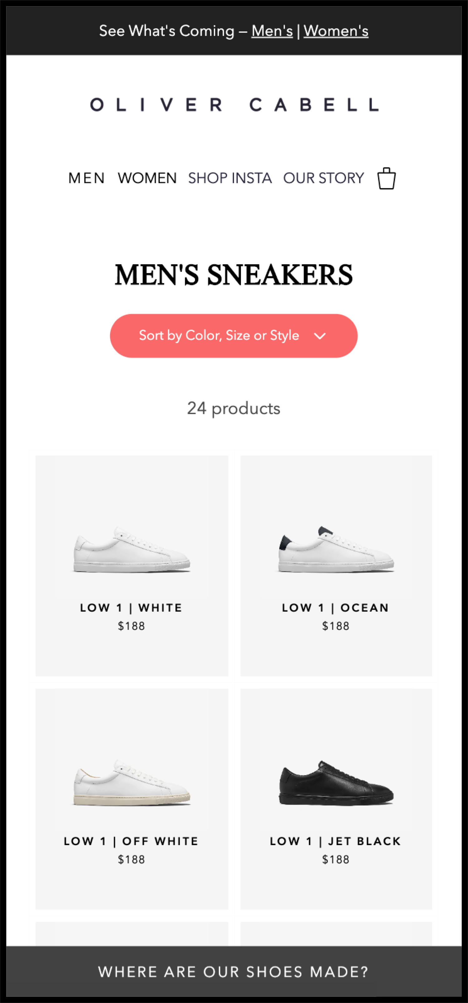
Variation 3
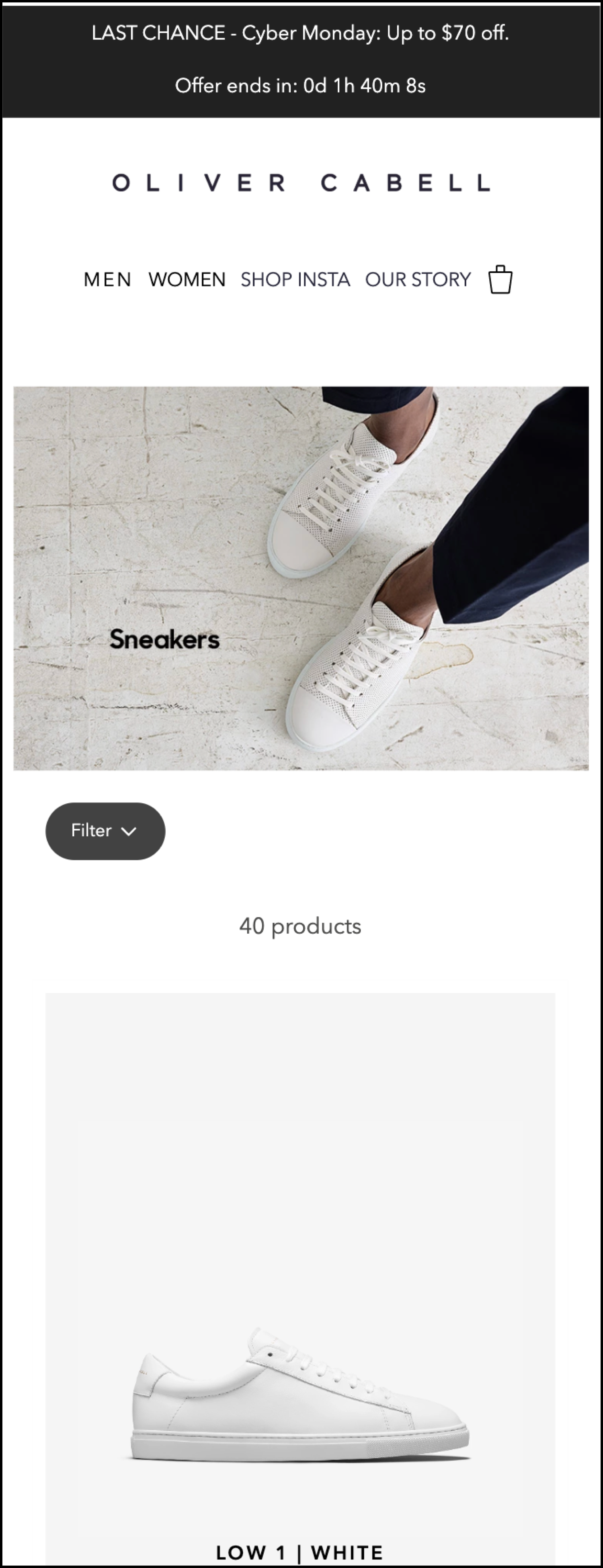
To help orient you, here is what the control looked like before our changes:
In Variation 3, we made 4 major changes:
- We removed the header image.
- We updated the Filter button so that it was more visible and more descriptive.
- We changed the product layout to a two-column layout.
- We added a fixed tab at the bottom of the screen that, on click, lets shoppers know where Oliver Cabell’s shoes are made. The goal here is to provide a point of assurance for the shopper.
Here is our concept:
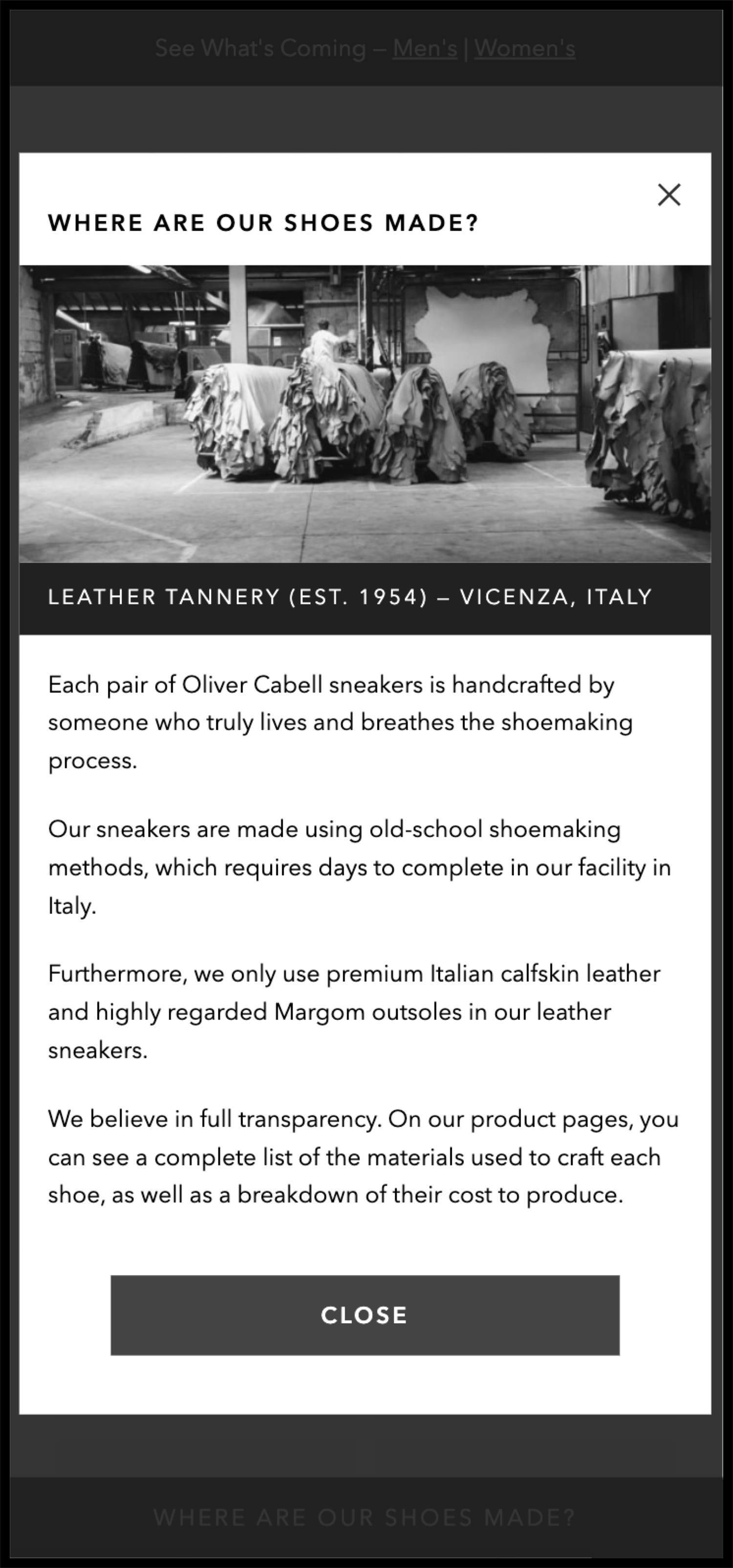
When the tab at the bottom of the screen is clicked, shoppers see this lightbox window:
Outcomes
For this test, as with all our A/B tests, we used Visual Website Optimizer (VWO) to split our traffic and track our data.
Our primary goal for this test was to drive more traffic to the product pages. After running the test for 3 weeks, we were able to achieve that goal.
Variation 3 resulted in a 14.86% lift in traffic visiting the product pages at 100% confidence (additionally, there was a 5.49% increase in traffic to the checkout page) and a 12.5% lift in revenue from category page traffic.
Why Our Concept Won
Our concept did a number of things that either improved the shopper’s experience or provided the shopper with assurance: 1) the concept increased the visibility of Oliver Cabell’s easy-to-use filter that helps shoppers narrow their search, 2) the concept allows the shopper to see more products at once without overwhelming them, and 3) the concept explains to the shopper that Oliver Cabell’s products are actually Italian made and that the company provides full transparency on their materials and pricing.
More Evidence
%
Tiege.com was already doing really well. They wanted to see how much further test to paid search landing page could be pushed.
Read Case Study%
What's better than a sales pitch that converts? A personalized sales pitch that converts.
Read Case Study%
Stix is on a mission to disrupt the golfing game. Consumers don't just buy a new golf club. A lot goes into that purchase.
Read Case Study%
Glemnetic.com is a leader in its space. We wanted to see if we could push conversion rates higher.
Read Case StudyARE YOU OUR NEWEST CASE STUDY?
We are laser focused on the type of client that our methodology and skills will give the highest return on investment and so if you meet our criteria for taking on new projects, we are confident you will see results like these.


