
Case Studies
Storytelling Increased Conversions 38.86%
- Goal:
- Increase conversion rates for HandicappedPets’ flagship product—Walkin’ Wheels dog wheelchairs.
- Solutions:
- Craft copy that tells a story and creates a personal connection between the shopper and the site.
- Maintain the shopper’s focus by making UX adjustments.
- Use our understanding of consumer psychology to address the shopper’s negativity bias and status quo bias.
- Outcomes:
- 38.86% increase in conversion rates for shoppers on the target page.
- Significant increase in revenue generated on this page.
At Frictionless Commerce, there’s nothing we love more than working with a client who makes a positive difference in the world. As manufacturers of dog (and other small pet) wheelchairs since 2001, HandicappedPets perfectly embodies that type of client.
Their products have great importance as they allow families to improve the lives of their disabled pets and avoid euthanasia. As they say on their site, they “believe that our aging, disabled, and injured pets are family and deserve to live happy healthy lives.”
Backstory
When reviewing HandicappedPets’ analytics, we saw something that raised our eyebrows. The behavior flow revealed that shoppers were often navigating from the homepage to the dog wheelchairs category page. From the dog wheelchairs category page, they would navigate to the “rear dog wheelchair” page, then back to the category page, then back to the “rear dog wheelchair” page.
This was an immediate signal to us that the category page was a point of friction for the shopper. This, compounded by the fact that this page receives the highest traffic volumes each month, let us know that the category page was a top priority.
Our Hypothesis
We believed we could produce at least a 10% lift in conversion rates if we: 1) crafted a story for the company and product to separate them from the competition, 2) restructured the page so that the most important details were mentioned first, and 3) moved the FAQ section higher on the page to answer shoppers’ questions much earlier.
Test Concept
To test our hypothesis, we crafted two concepts. To orient yourself, first take a look at the control page that we worked on:
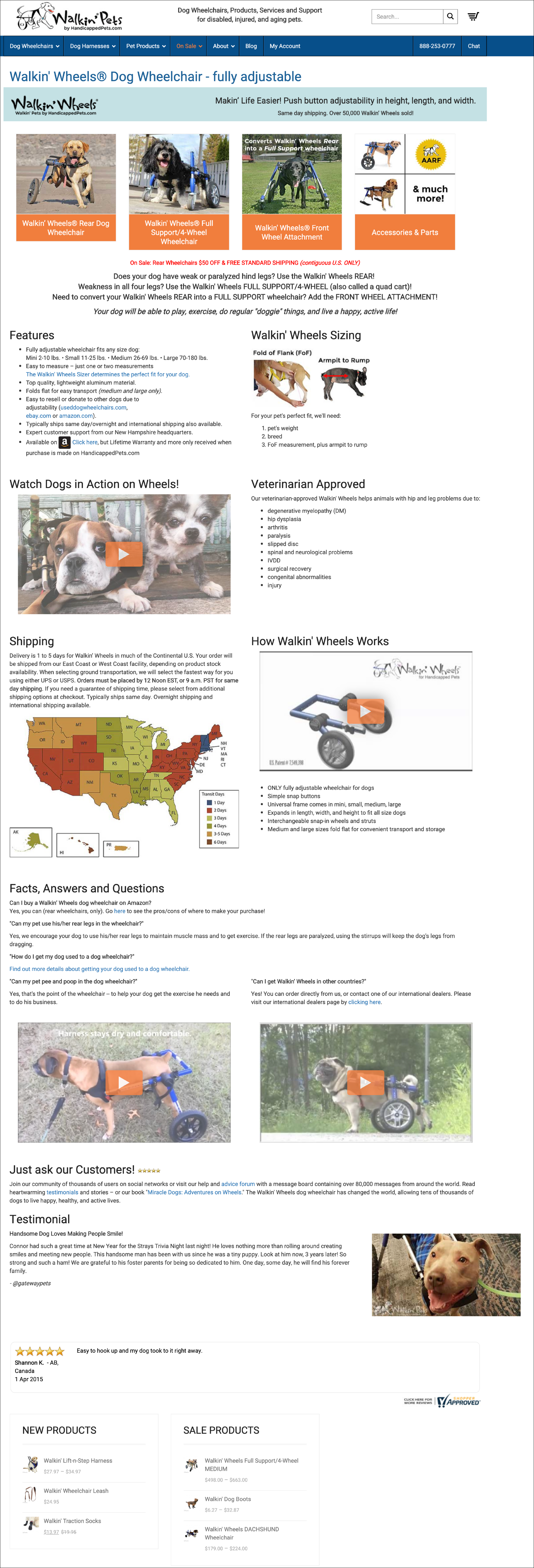
Variation 1
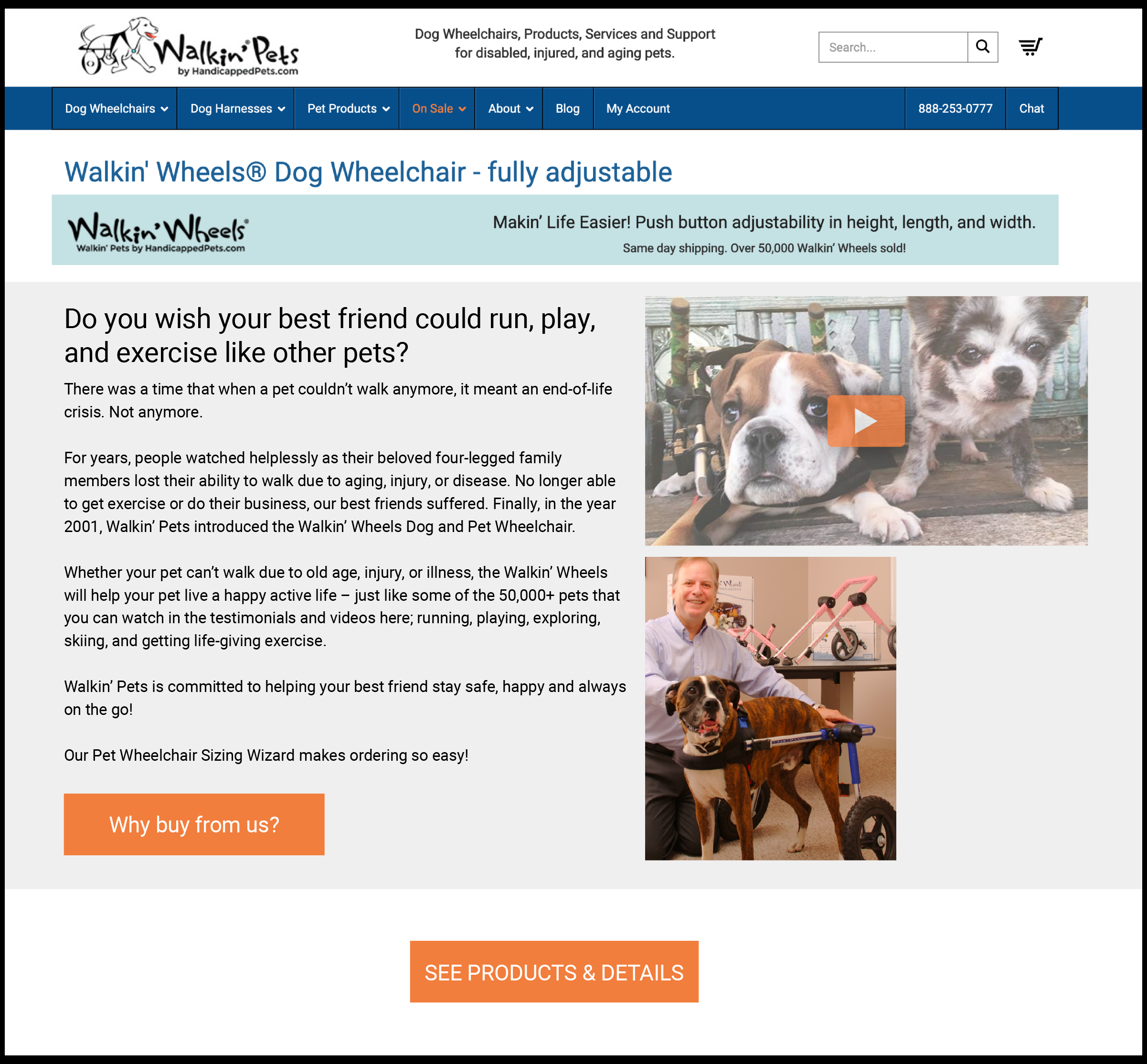
First, we moved all the content on the page down to make room for a new section.
Here’s the section we added:
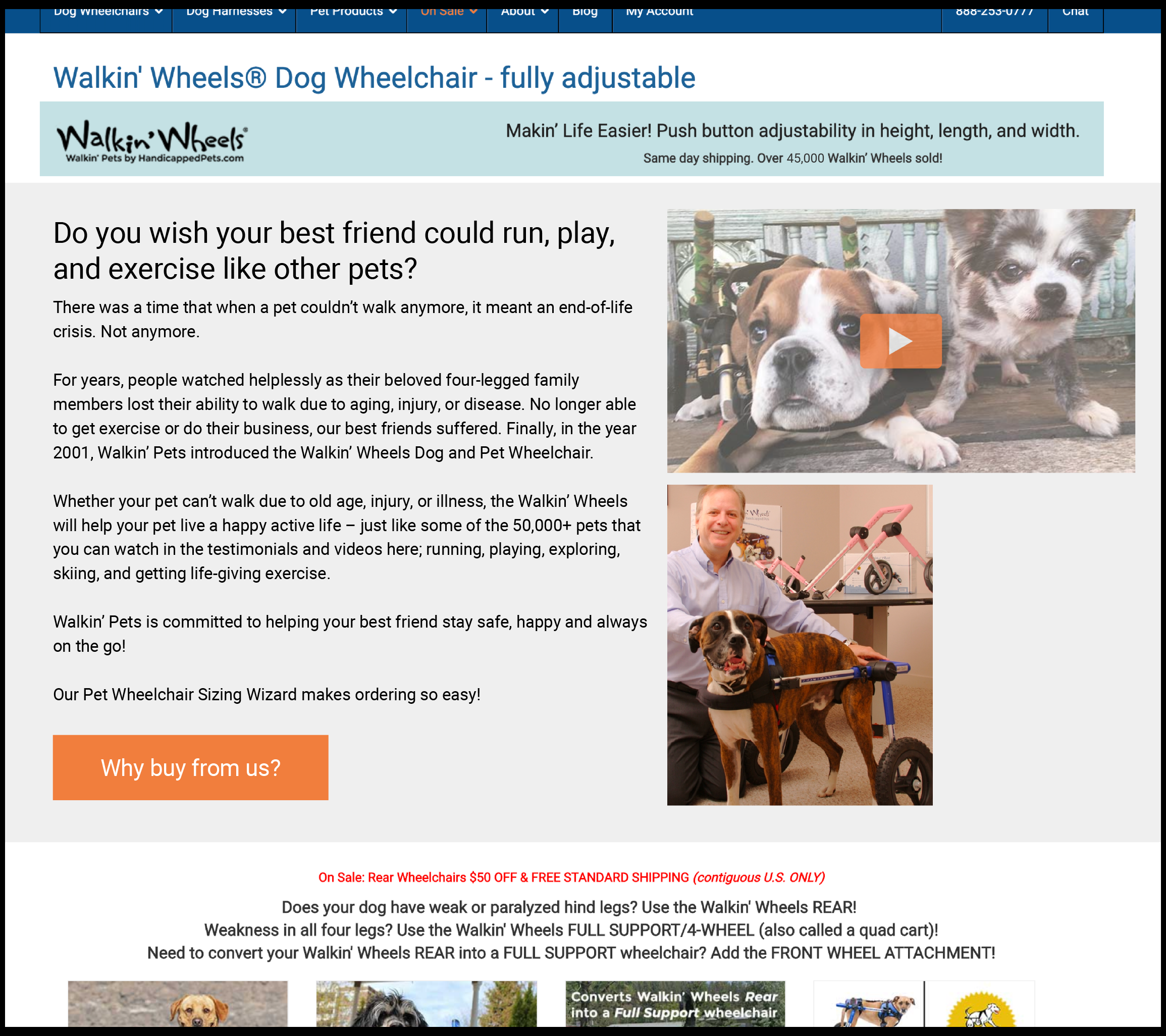
You’ll notice at the bottom of this section we also added a button that says “Why buy from us?”
This is a simple question that almost 0% of businesses answer on their sites. But when answered correctly, it can be the difference between an on-the-fence shopper abandoning the site or making an order.
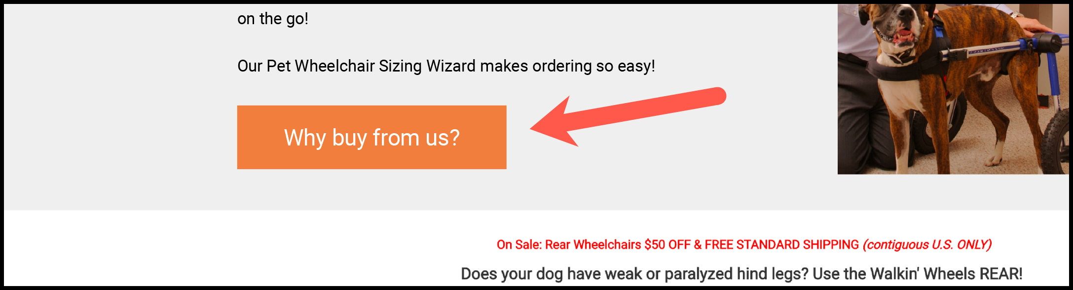
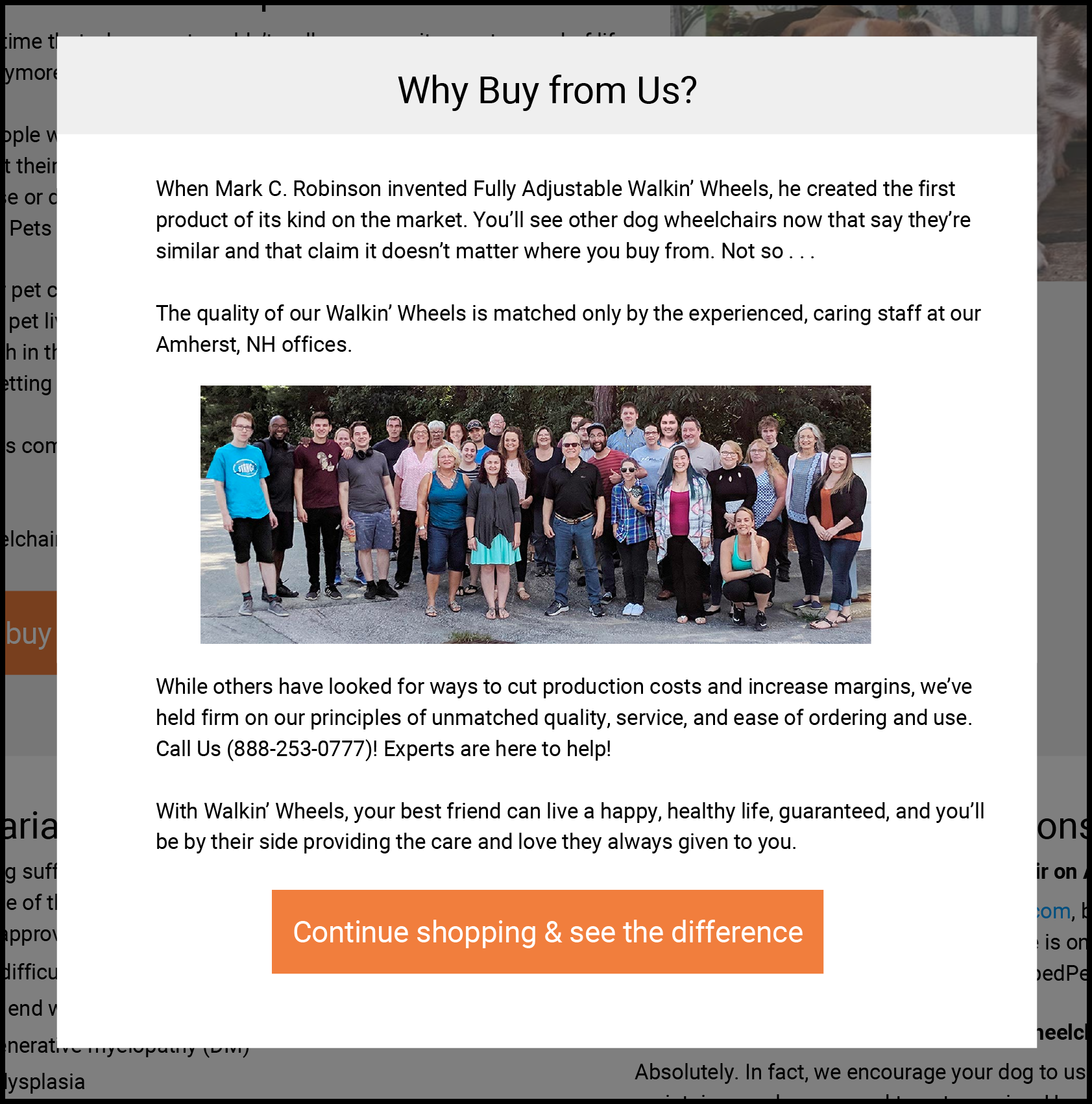
This is what we show shoppers who click on “Why buy from us?”:
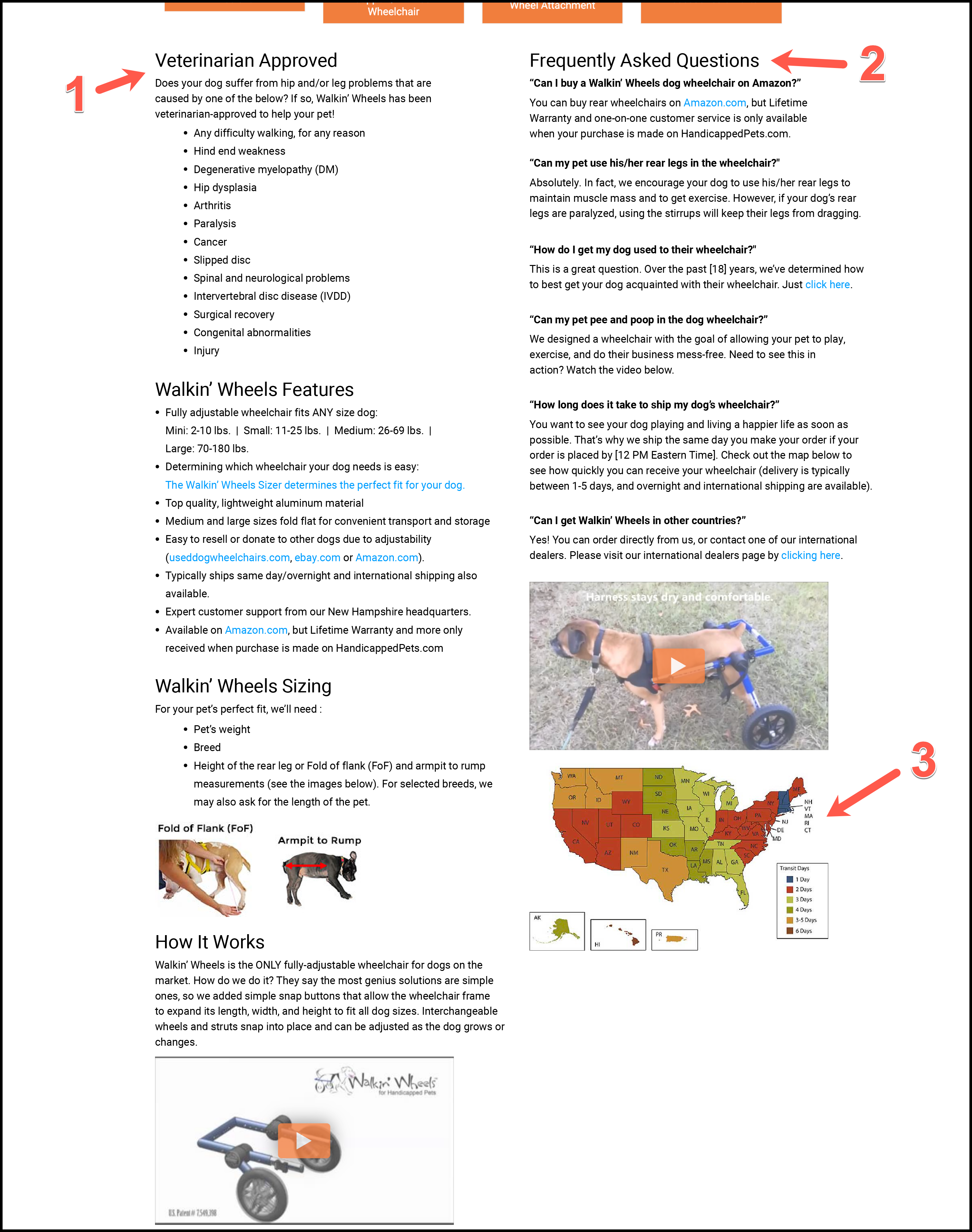
Lastly, we structured the content below the fold in what we believed was a more logical way to tell the shopper about HandicappedPets’ dog wheelchairs:
- We’ve placed the “Veterinarian Approved” section first to confirm to the shopper that this product will meet their dog’s needs.
- We’ve placed the FAQ section at the top of the page to address the shopper’s questions and concerns as early as possible.
- We’ve placed the shipping section last, as that is the least important piece of information for the shopper when they are first learning about a product.
Variation 2
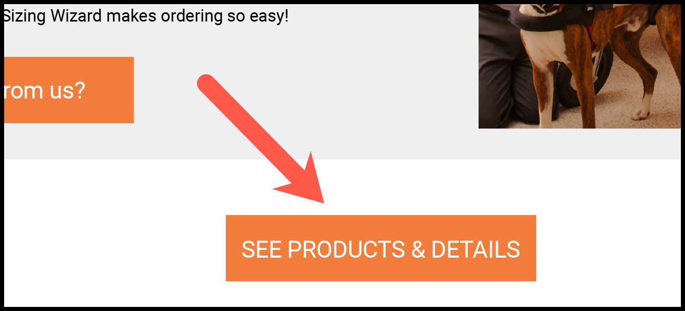
Variation 2 is the same as Variation 1 apart from one difference: instead of showing the full page by default, we hid all the below-the-fold content behind a call to action. See below:
When the shopper clicks on “SEE PRODUCTS & DETAILS”, they will then see all the content we showed you in Variation 1.
What was our goal here? We wanted to do two things: 1) We wanted to ensure that all users saw the new copy we added, and 2) We wanted to reduce the shopper’s cognitive load by allowing the shopper to focus on our copy first, then select when they were ready to see the products and details.
Outcomes
Our primary conversion goal—the one we’d use to determine a test winner—was to see a 10% lift in completed orders at 95% confidence. Due to the traffic on this page, we had to run the test a bit longer than usual—approximately 6 weeks.
The results were even better than we had anticipated. After running the test for 6 weeks, both variations significantly outperformed the control’s baseline metrics.
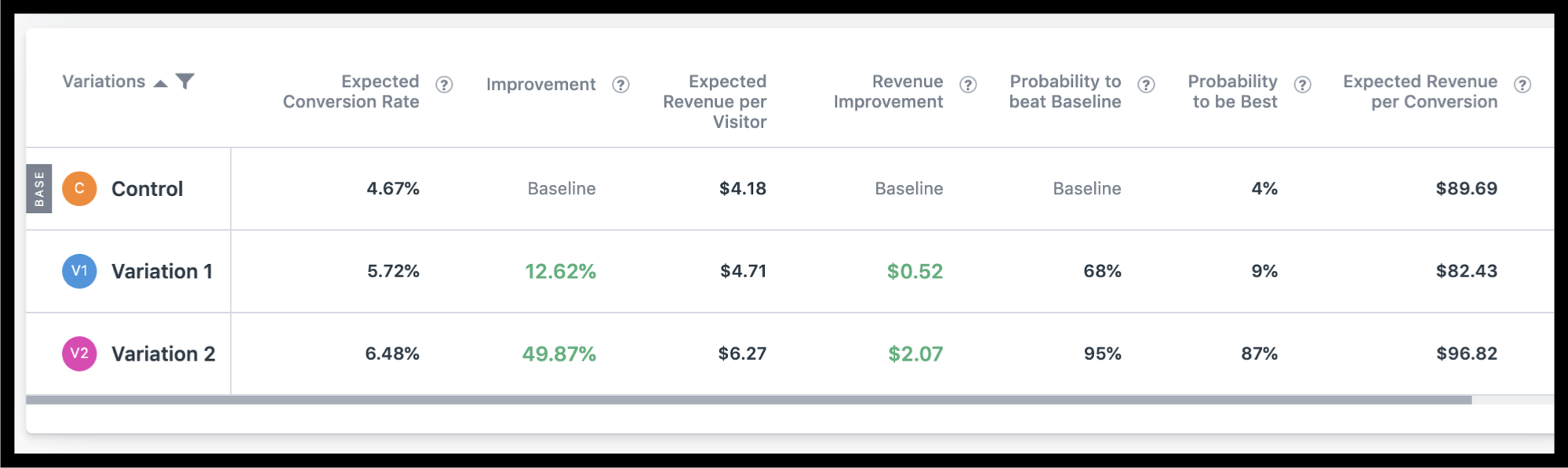
The conversion rate for the control was 4.67%. Variation 1 saw a 22.65% lift for a conversion rate of 5.72%.
Variation 2, however, saw a 38.86% lift for a conversion rate of 6.48% at 98% confidence.
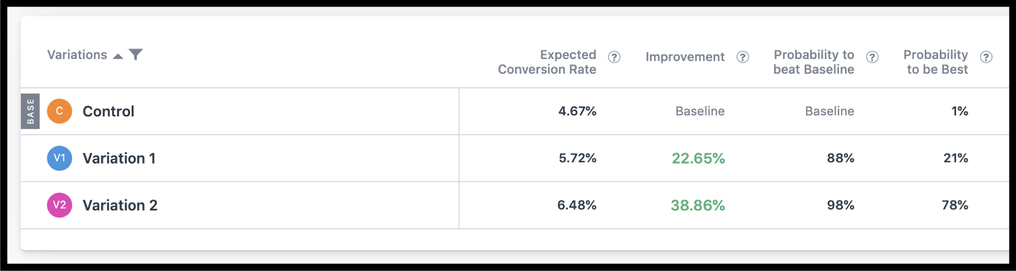
Furthermore, Variation 2 resulted in a 49.87% increase in revenue per visitor at 95% confidence.
The results of our click tracking goals confirmed our hypothesis for Variation 2—that more people would engage with the original copy and “Why buy from us?” button we added if we hid the below-the-fold content by default
In Variation 1, 2.53% of shoppers clicked on the “Why buy from us?” button. In Variation 2, however, the number was 5.94% (2.35x higher).
Why Our Concept Won
Our concept narrowed the focus of the shopper and strategically inserted “good friction” (friction that slows the shopper down so that they see our content) to encourage the shopper to read our message. Our message contains information that allows the shopper to see the value in the company and connect with it on a more personal level: they can see the origin story and the faces of those behind the business.
These are details that are typically located in low-visibility areas of a site (the About Us/Our Story page, usually found in the page footer). By bringing them to the shopper instead of relying on them to find it themselves, we’ve increased conversions.
More Evidence
%
Tiege.com was already doing really well. They wanted to see how much further test to paid search landing page could be pushed.
Read Case Study%
Stix is on a mission to disrupt the golfing game. Consumers don't just buy a new golf club. A lot goes into that purchase.
Read Case Study%
Glemnetic.com is a leader in its space. We wanted to see if we could push conversion rates higher.
Read Case Study%
This client's viral video was driving a ton of traffic to their bestseller page. Our job was to convert that traffic...
Read Case StudyARE YOU OUR NEWEST CASE STUDY?
We are laser focused on the type of client that our methodology and skills will give the highest return on investment and so if you meet our criteria for taking on new projects, we are confident you will see results like these.


