
Blog
Your Most Important Conversion Goal
Many businesses are developing different strategies to get shoppers to stay on their sites. The problem is not many of these strategies are working because marketers are making the wrong assumptions about shoppers.
For example, when a shopper arrives at Kittyhawk.com—the online store for Kitty Hawk Kites—this popup appears after a few seconds:
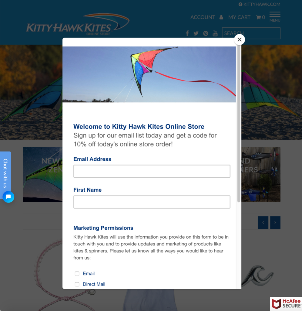
Kitty Hawk Kites is making the assumption that shoppers will immediately stop what they’re doing to read a popup.
But shoppers hate popups. They’ve been conditioned to because of how intrusive they’ve been in the past. However, that doesn’t mean we should avoid popups. Instead, that means we need to rethink how we’re using them.
The goal of this popup on Kittyhawk.com is to generate email signups and encourage shoppers to make a purchase after receiving their 10% off coupon code. That’s a great deal, especially if you’re really considering a new kite.
But I highly doubt most shoppers are reading beyond the first two words of this popup before clicking the ‘close’ button.
Today, this is a shopper’s instinct.
We’ve developed a concept to slow the shopper down and increase the chances they’ll read our popup message.
Here’s our idea:
Popup message reads:
WE’VE GOT A SPECIAL MESSAGE WAITING FOR YOU
Spend 10 minutes exploring our unforgettable kites, wind spinners, and more, and we’ll give you a special offer that you don’t want to miss out on.
Your time starts now: 9:59
There are 3 major changes we’ve made that will result in higher conversions:
1: The Popup Design
Instead of a conventional square or rectangular popup, we designed a circular popup. This is unconventional and unexpected, which will naturally slow shoppers down.
Additionally, the ‘close’ button is detached from the popup, which forces the shopper to take an additional couple seconds to find the ‘close’ button, providing more time for them to notice our messaging.
Lastly, we’ve added design accents to make the popup truly “pop”. There isn’t anything visually interesting about the popup on the control (the current site).
2: The Messaging
Instead of asking shoppers to immediately provide their email address, we’re using our Challenge tactic to encourage the shopper to look around on the site for 10 minutes. After doing so, we’ll give them a “special offer” that they won’t want to miss out on.
Humans are a naturally curious species. When you hide something from them, they’ll want to know what it is. Our concept is taking advantage of that instinct.
We’re also achieving another goal with this challenge. If shoppers stay on the site for 10 minutes, they’ll likely see a number of products that may suit their wants or needs. Instead of just adding a single kite to their shopping cart, they may find 2 kites and a wind spinner that they just got to have.
After they spend 10 minutes on the site and receive their 10% off coupon code, they’ll be able to convince themselves more easily to add the 2 kites and wind spinner to their cart.
3: The Countdown Timer
At the bottom of the popup is a bright green countdown timer. This isn’t here to just let shoppers know their challenge has begun and they’ll soon see our special offer.
The true purpose comes before shoppers even read the popup.
Since this is a countdown timer, the numbers change every second. This changing element will grab the shoppers attention immediately. They’ll want to know what the heck this countdown is for. Then they’ll read the whole popup and see our challenge.
These are the types of assumptions we should be making.
Shoppers, like you and I, have short attention spans. We don’t always want to admit it, but it’s true. Because of this, we need to think deeper about strategies to keep shoppers on our sites.
One school of thought insists that we need to make the shopping process as quick as possible. But as you can see in our popup concept, sometimes it’s better to slow a shopper down or else they’ll entirely miss some compelling information.
How can you apply this to your site?
A little about us
Thank you for reading this article. We are Frictionless Commerce and over the last 11 years, we’ve thought about just one thing: how do we get online shoppers to convert? We’re fascinated by buyer psychology. Once we’ve understood how your site visitor thinks we use our 9 point copywriting process to convince and convert them.
Other buyer psychology-based eCommerce conversion ideas
If you liked this article you’ll love our other ideas:
“Is My Marketing Working?” A Unique Product Page Design Idea
Product Reviews & Buyer Psychology


